Interim Head of Design | Lev | 2019
Amsterdam, The Netherlands
I was the Interim Head of Design for this novel electric vehicle sharing service that launched in Rotterdam in July 2019. My responsibilities encompassed all aspects of graphic design (print and screen) and UX design that a new company requires, as well as acting as the lead creative for our early marketing efforts. This is a role I very much enjoyed and am looking to do again with the right small company again.
My role was created with the understanding that as the company would grow, so would its design group. But for the early days starting up, it’s particularly beneficial to have someone in house who can do a wide range of design tasks, especially UX and brand identity. In this position I also considered how future designers, with their own specialties, could be onboarded more smoothly. I had a six-month period to work, at which time I would need to return to the US to arrange for a permanent work visa. One of my main priorities was to provide enough design infrastructure and standards so the non-design staff would be able to carry on with basic design assets in place. This was also important to me in the unforeseen event where I would not be able to return to the Netherlands, which sadly did manifest with the COVID pandemic.
UX Flows and Conditions
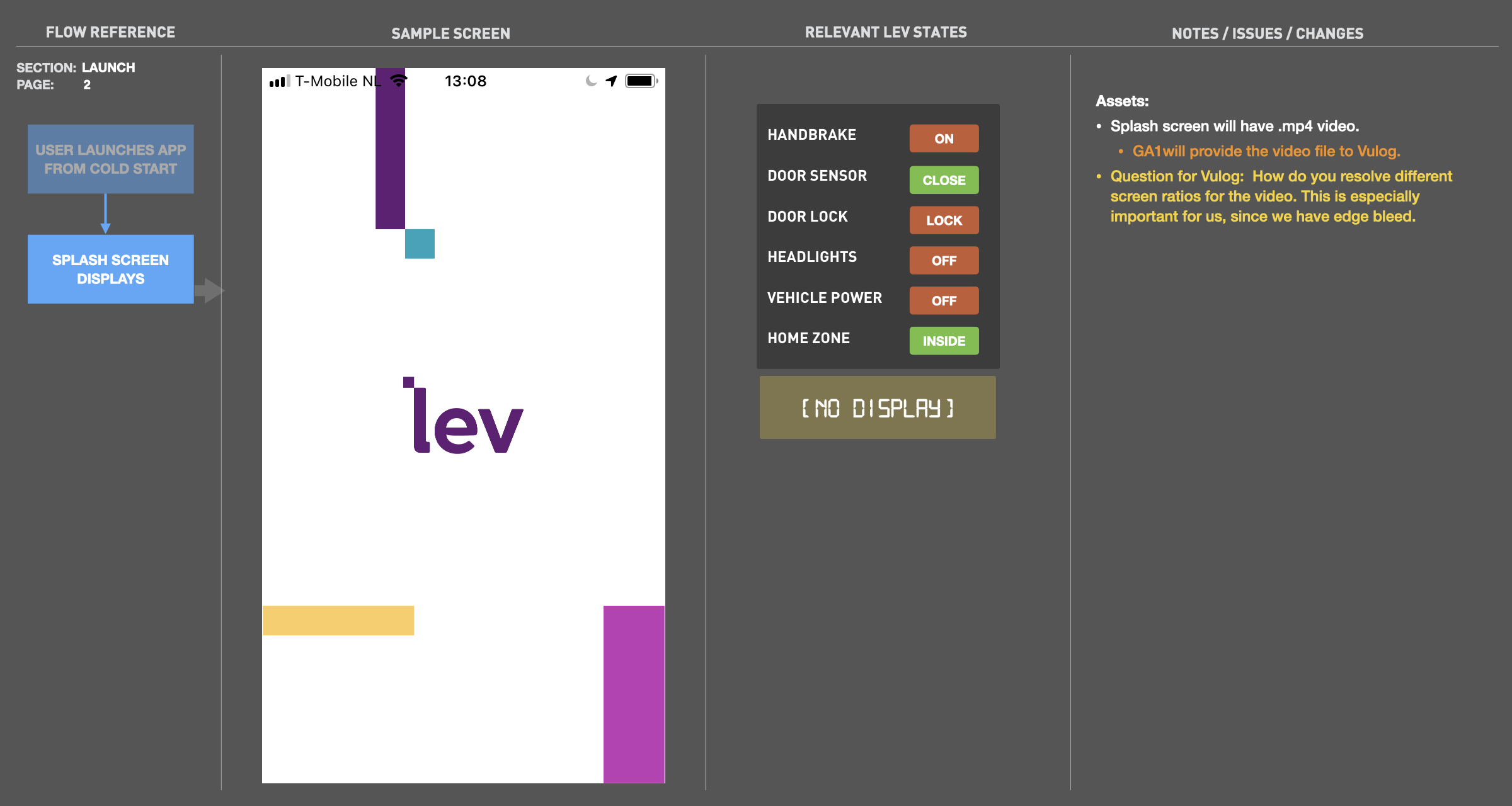
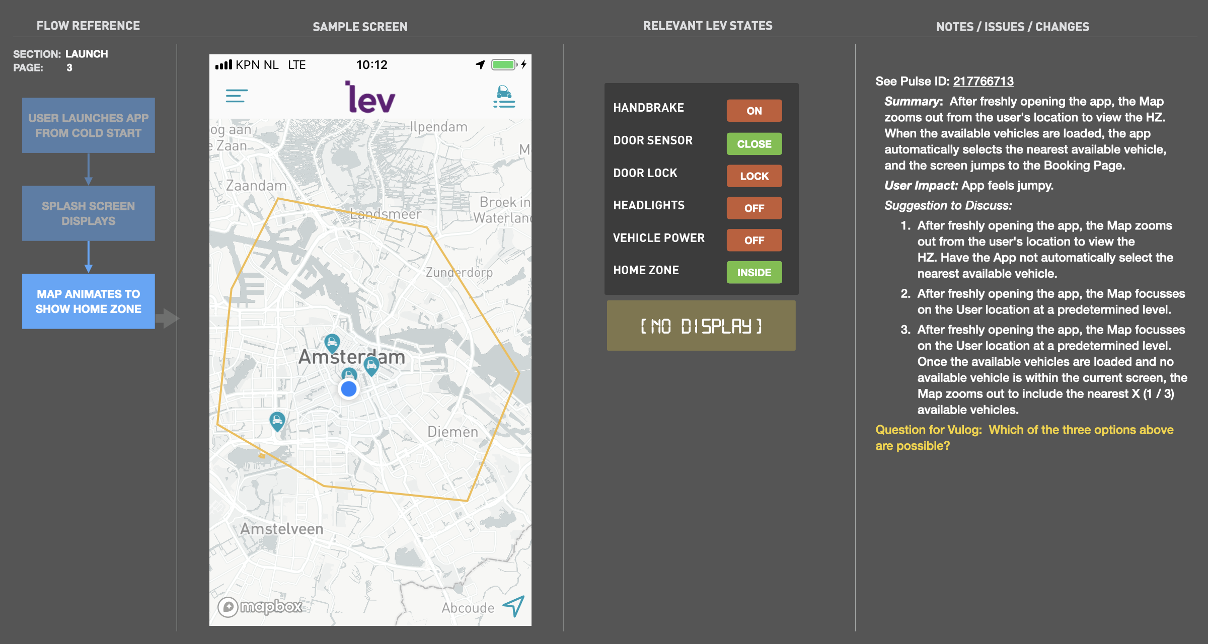
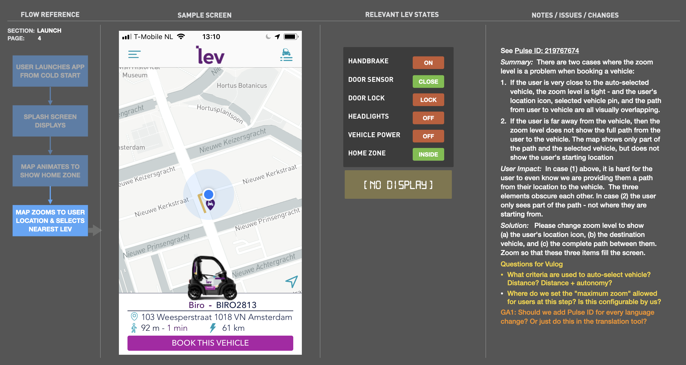
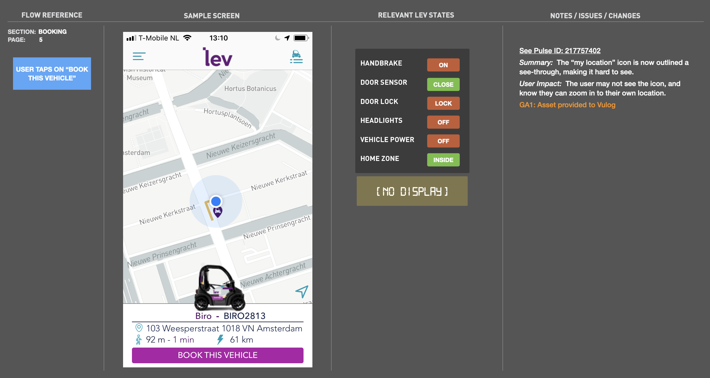
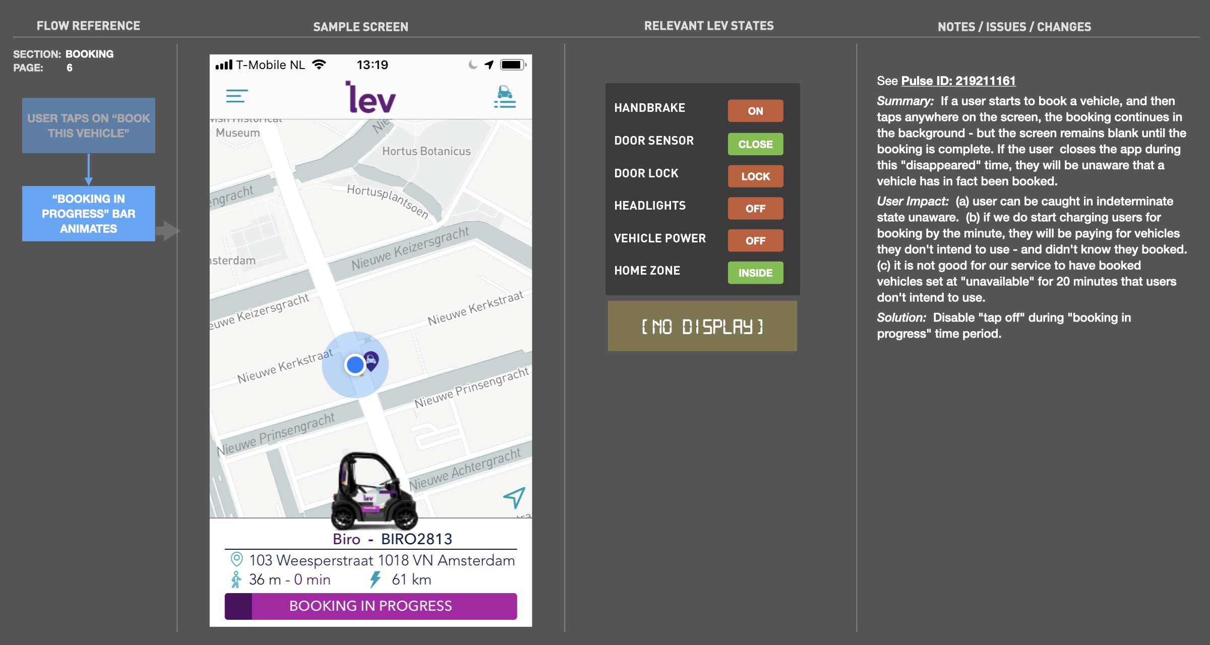
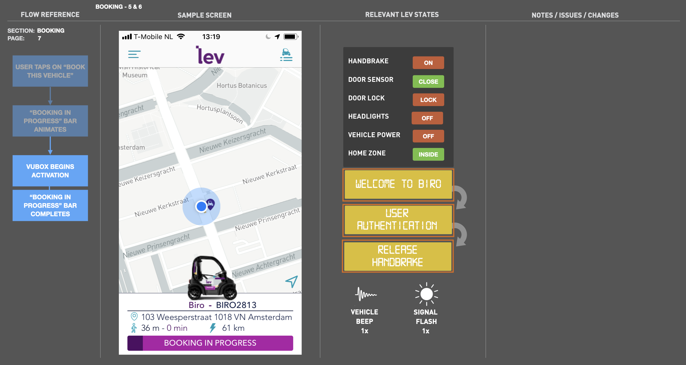
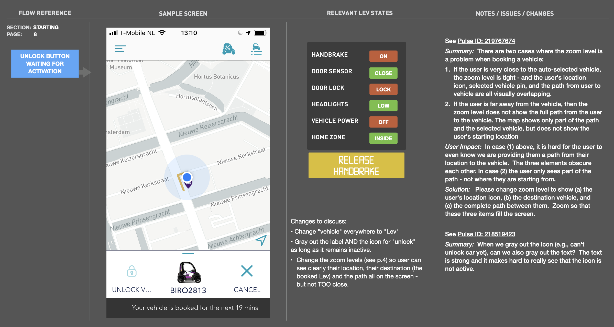
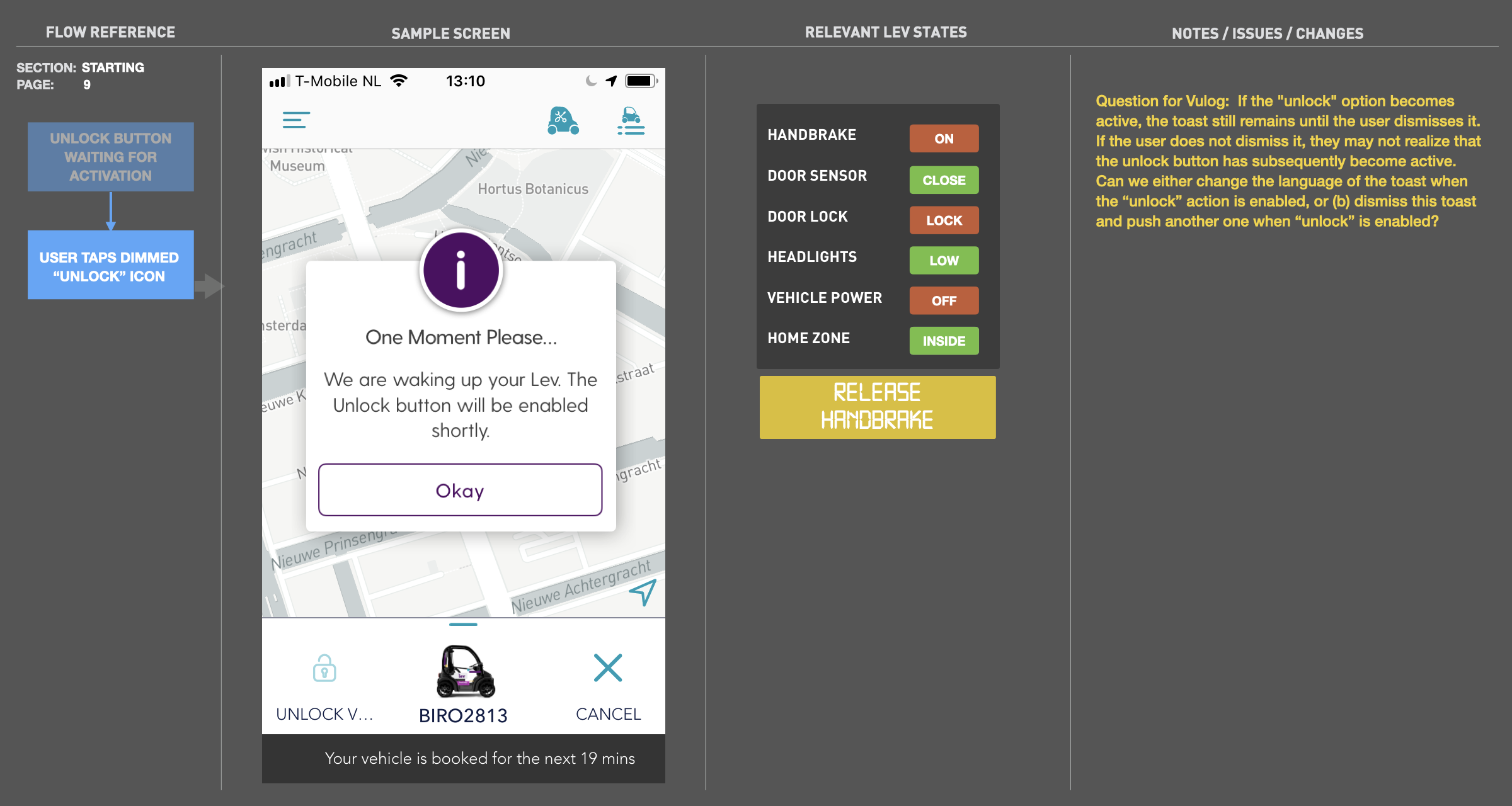
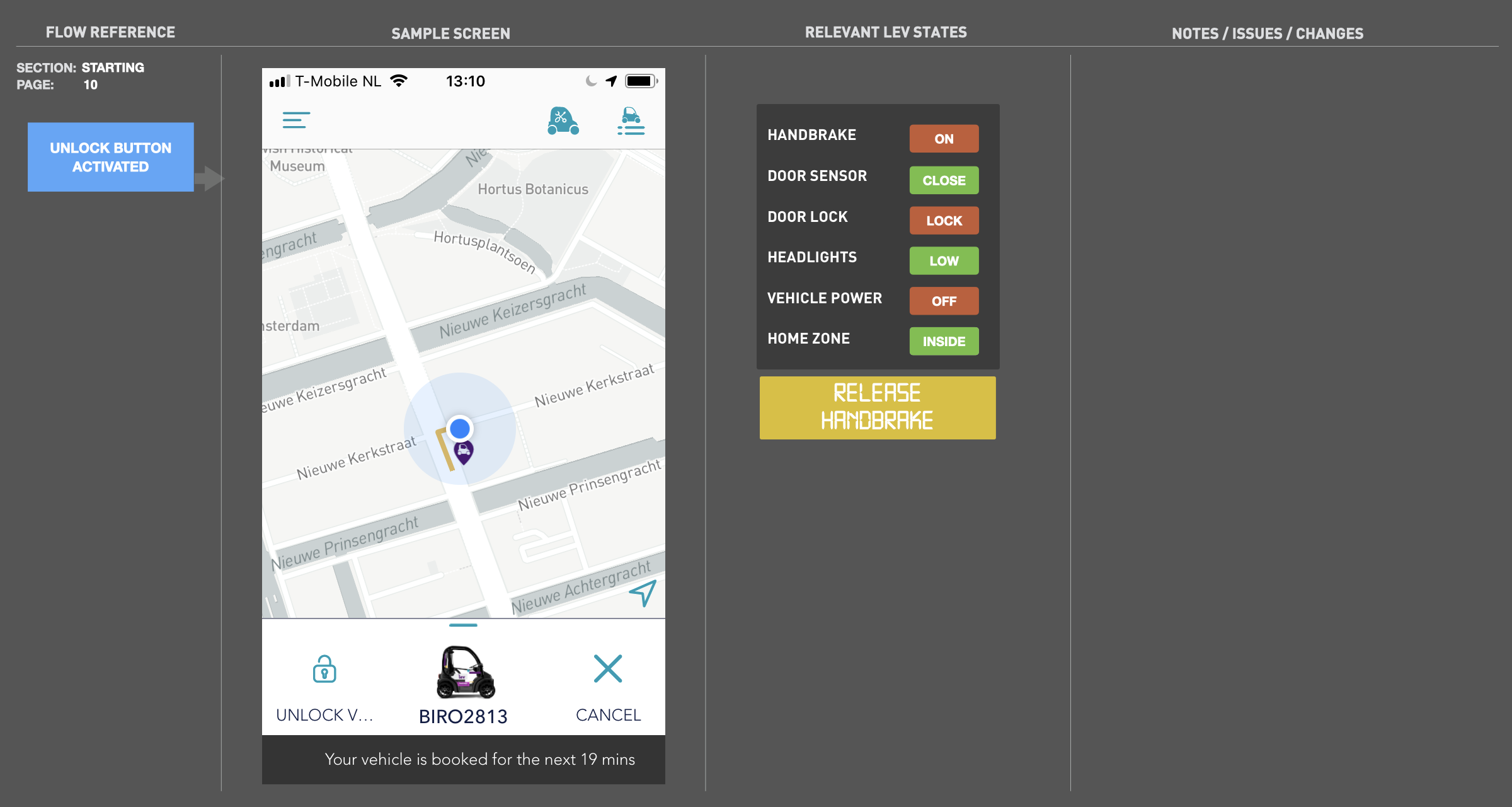
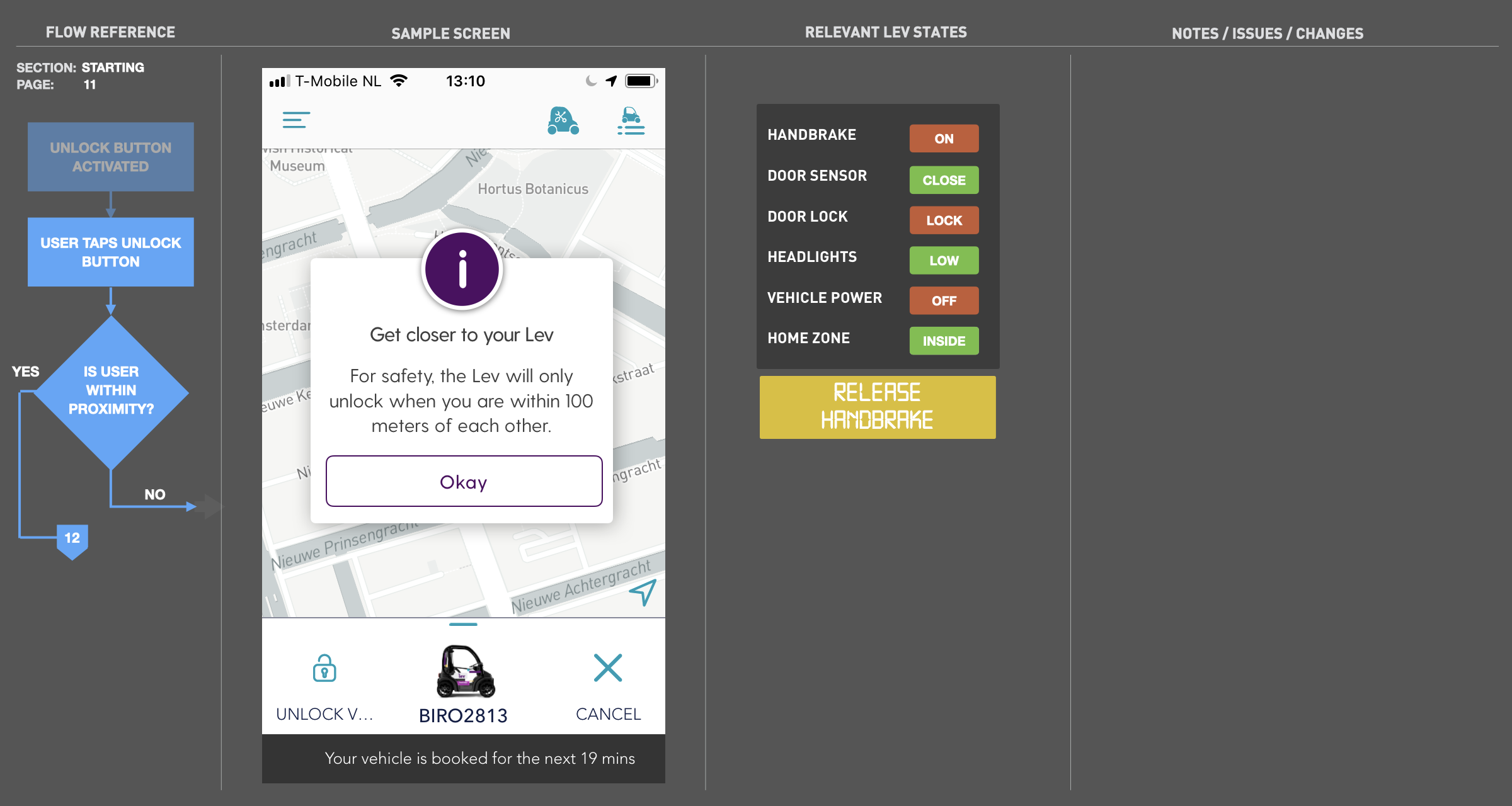
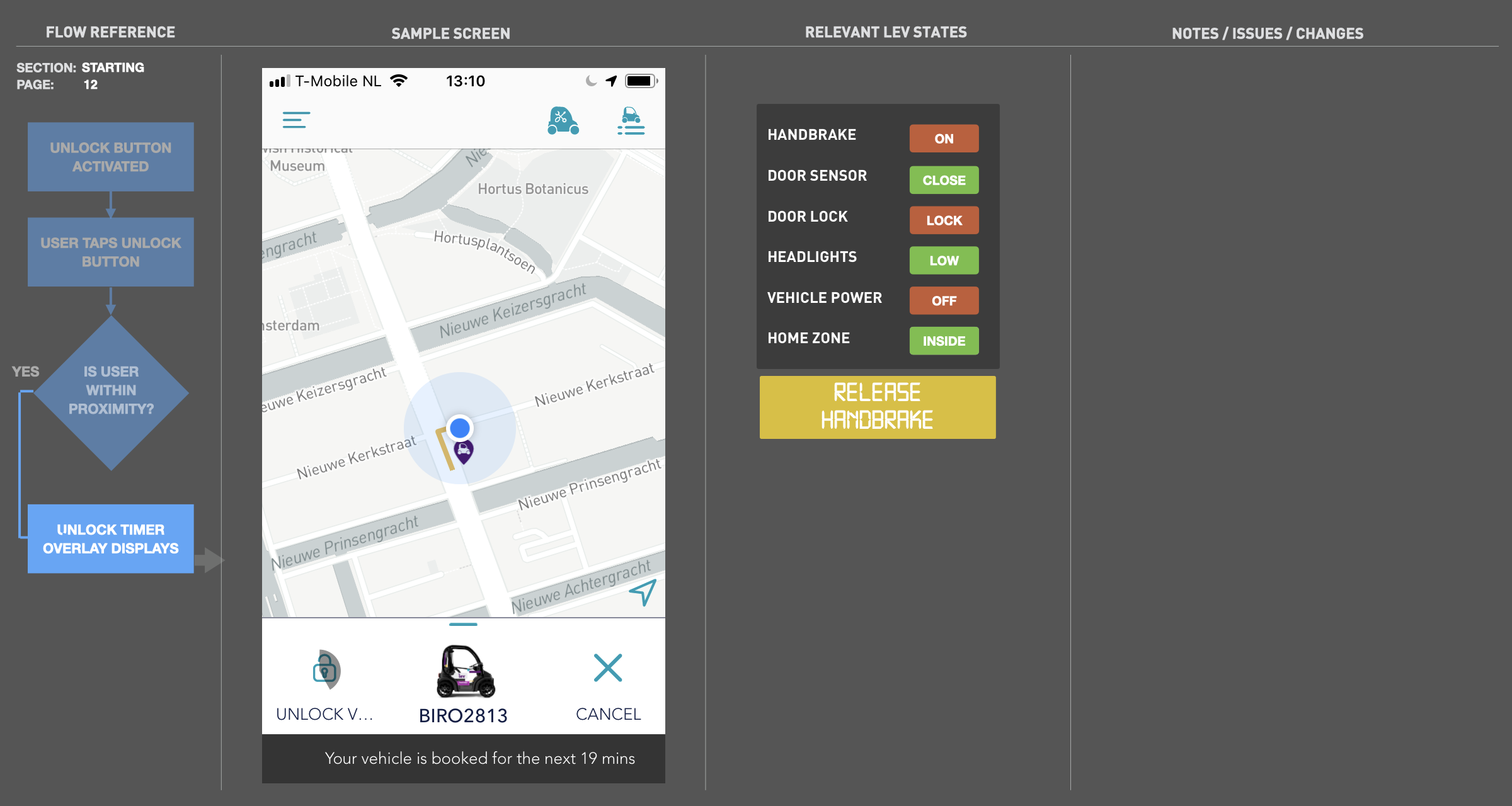
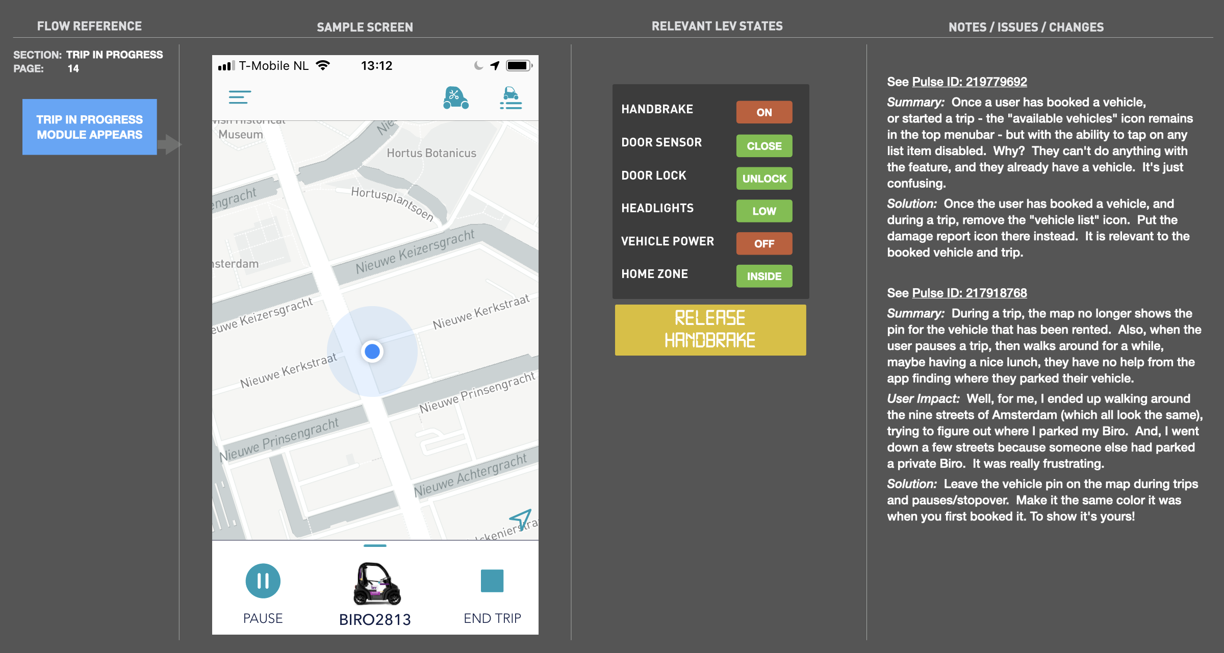
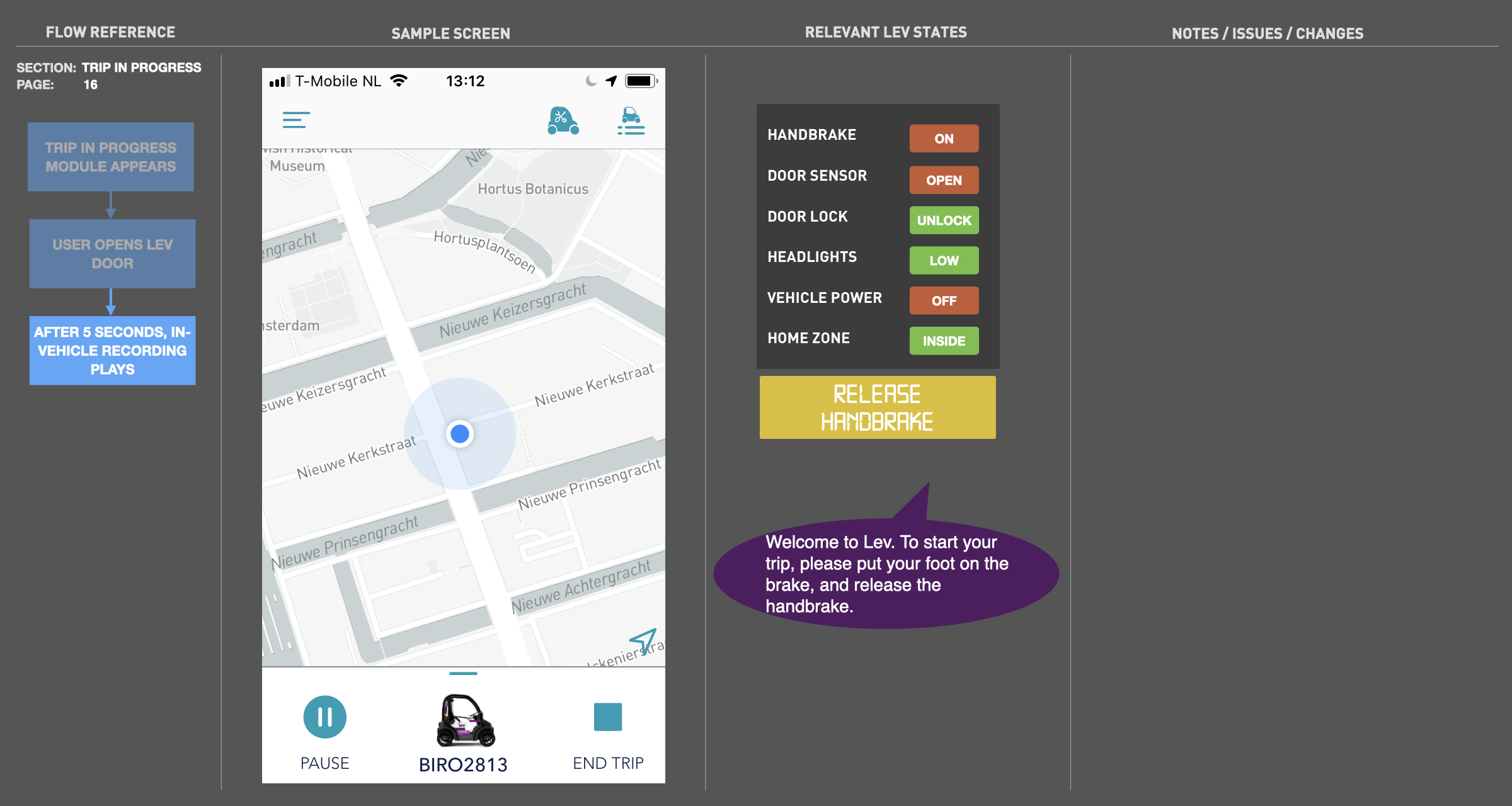
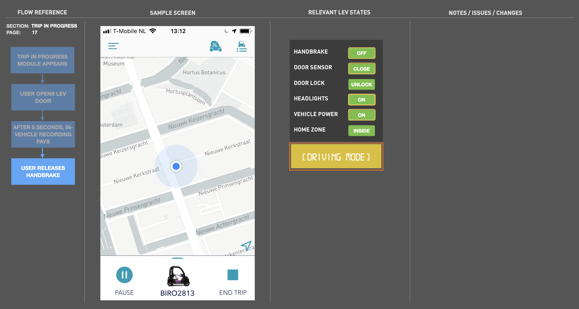
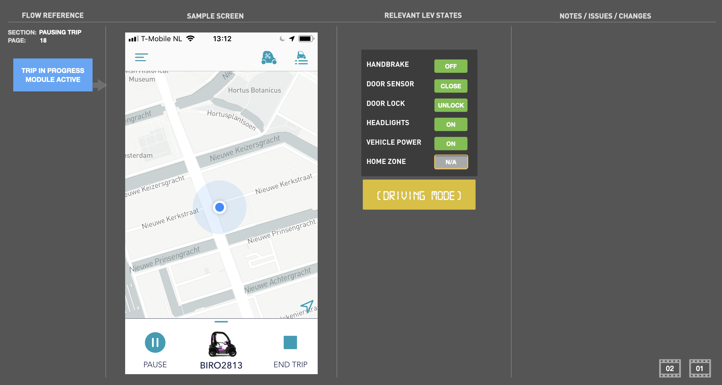
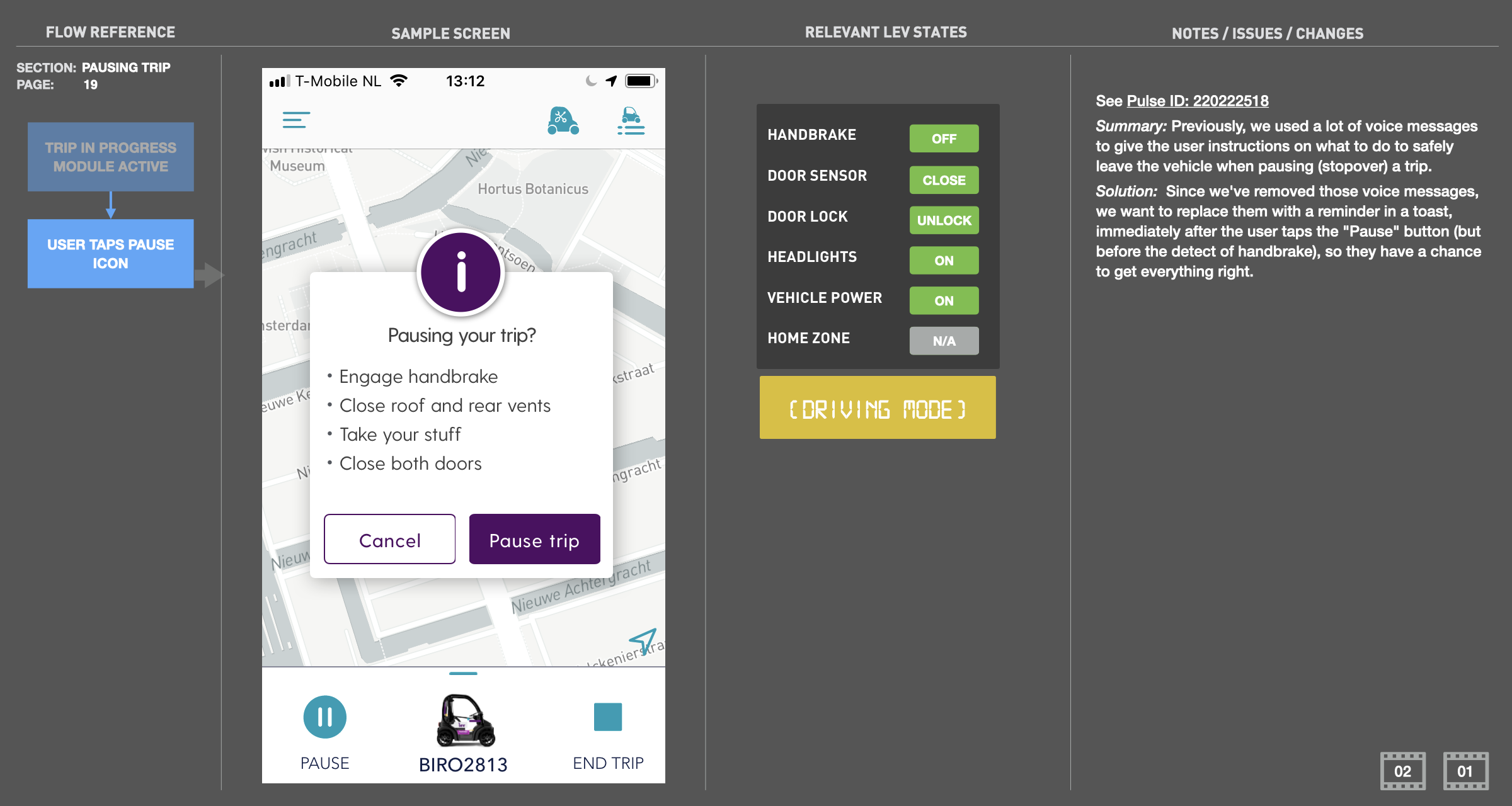
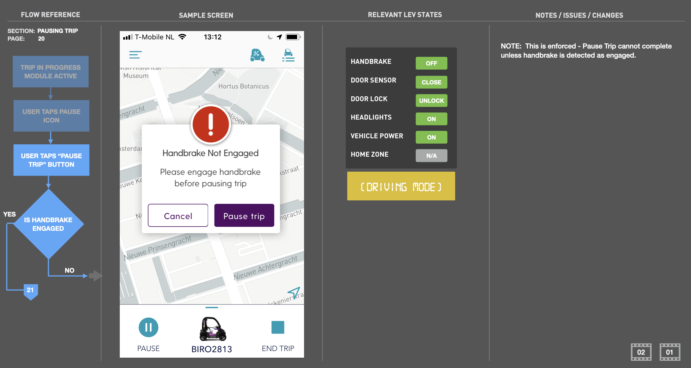
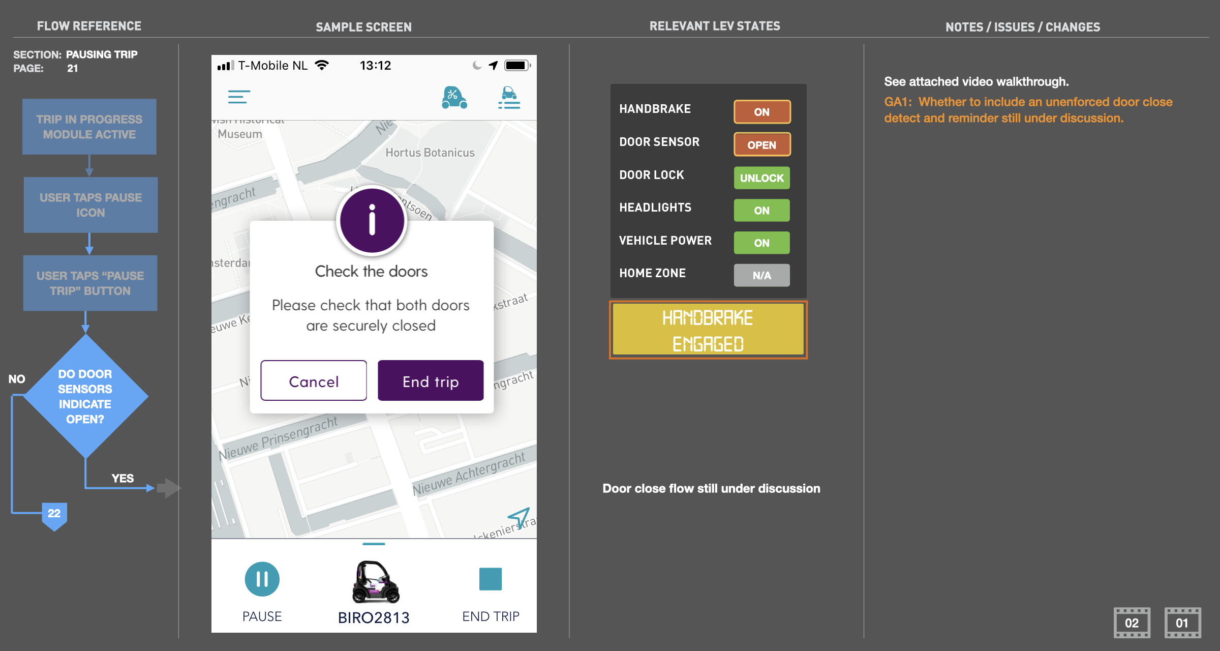
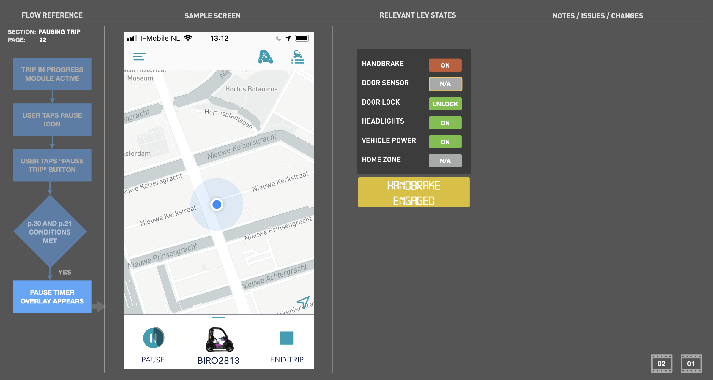
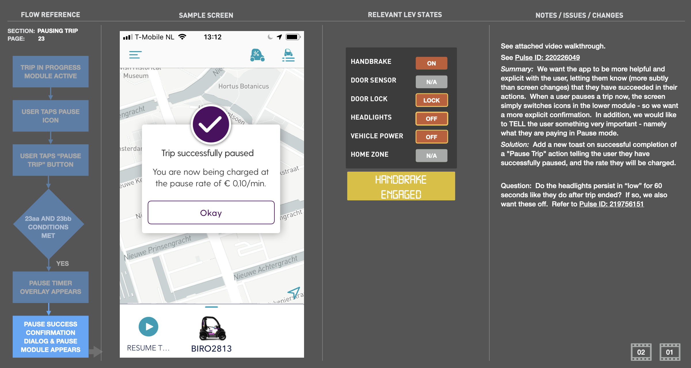
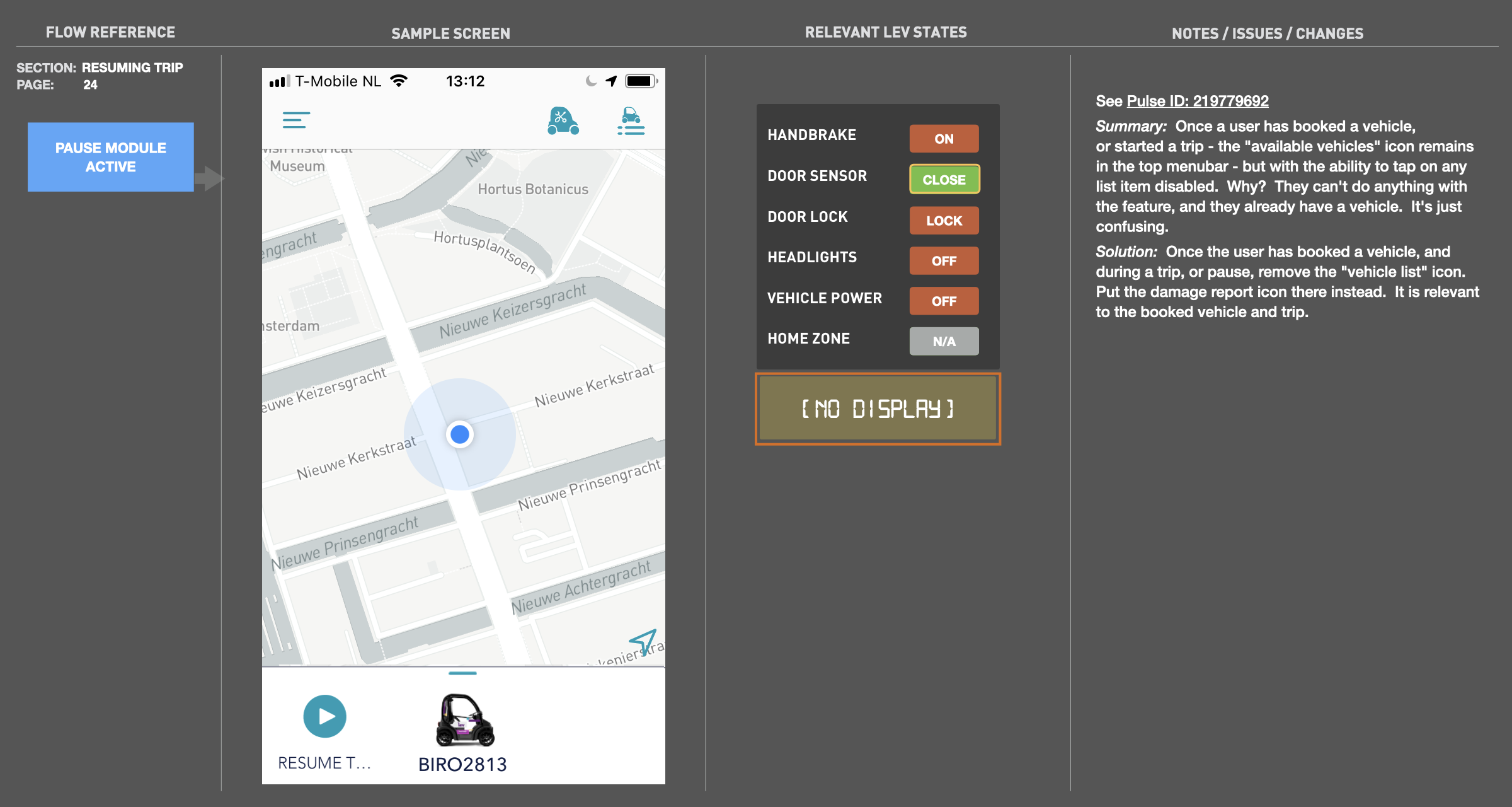
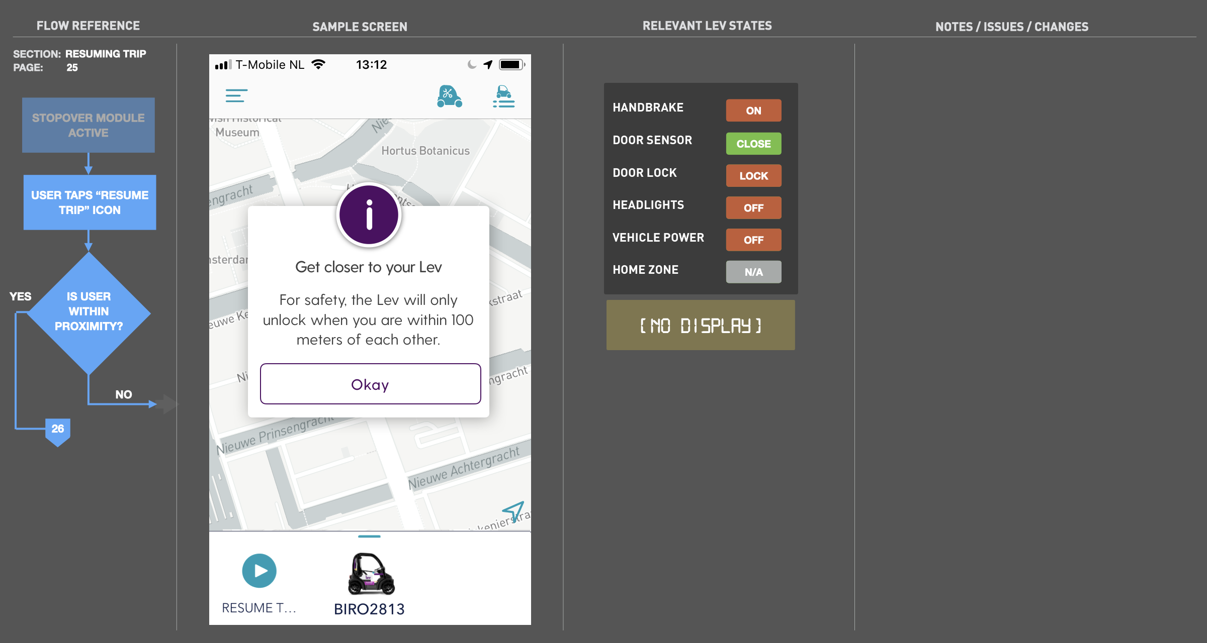
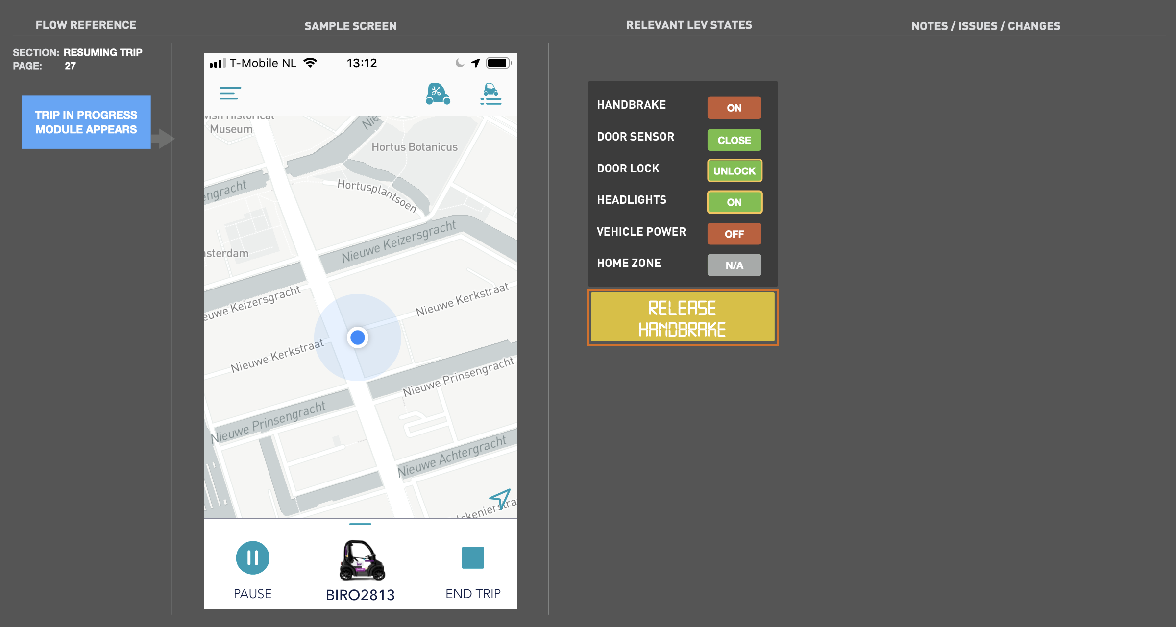
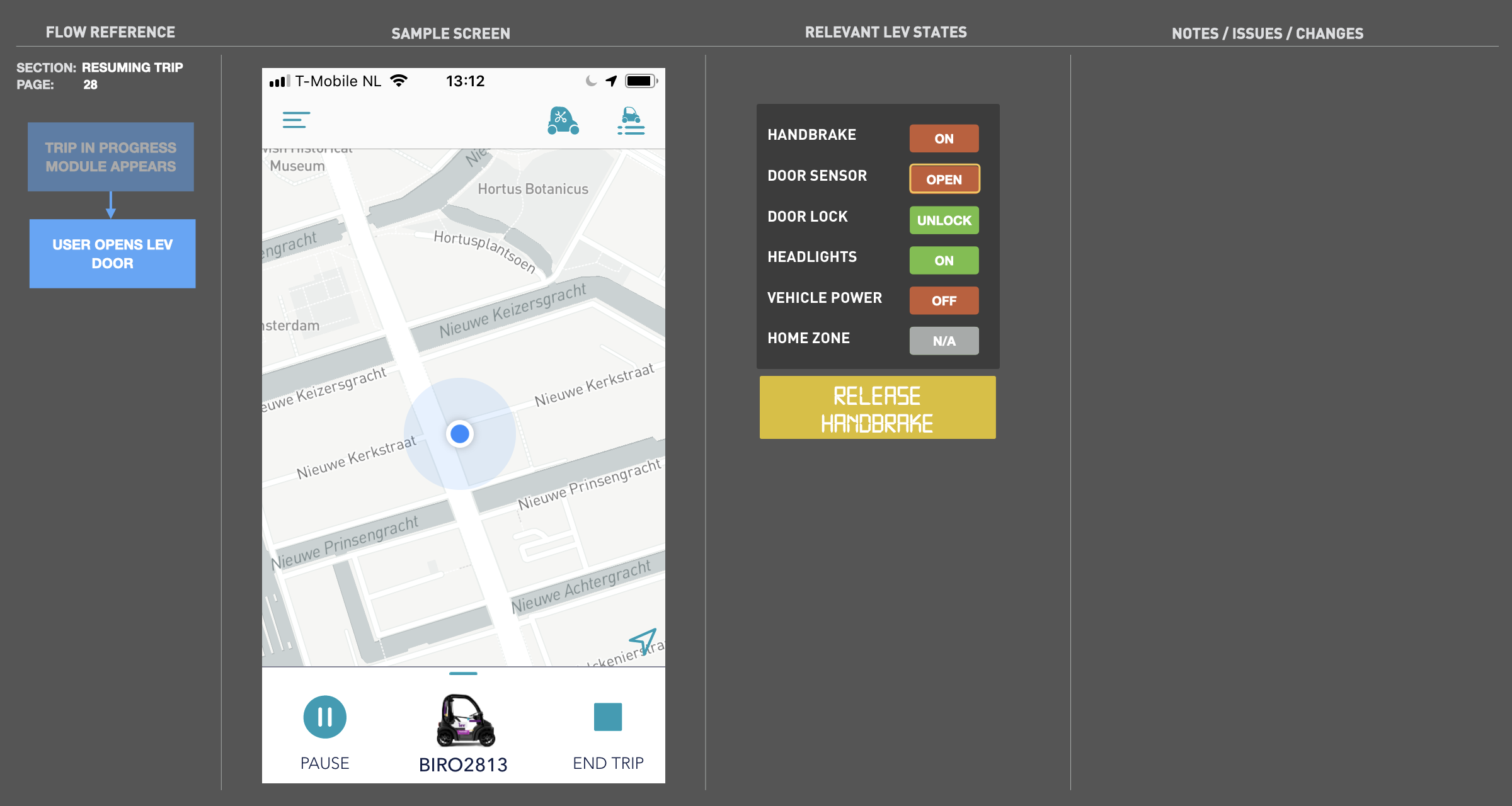
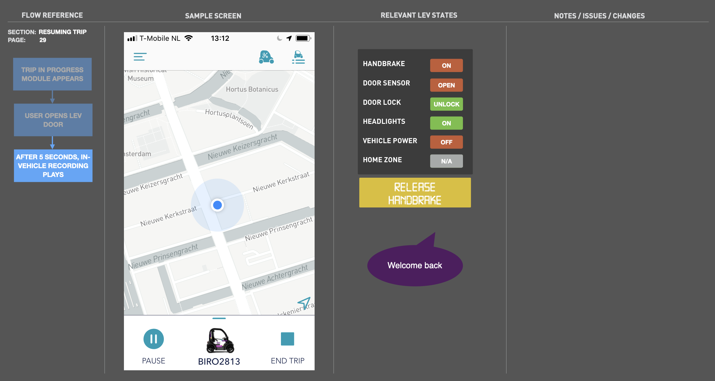
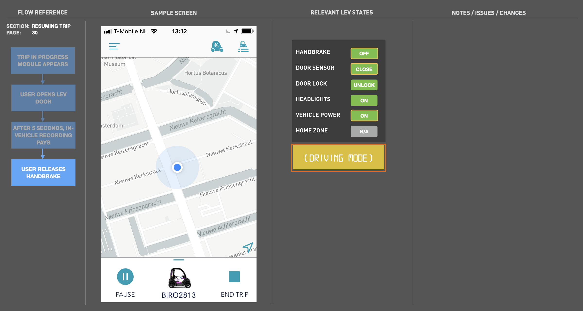
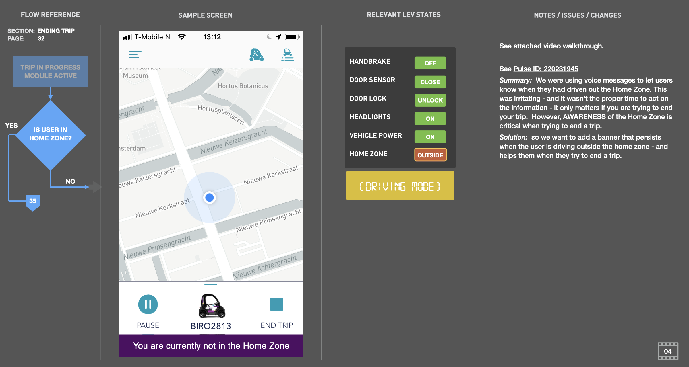
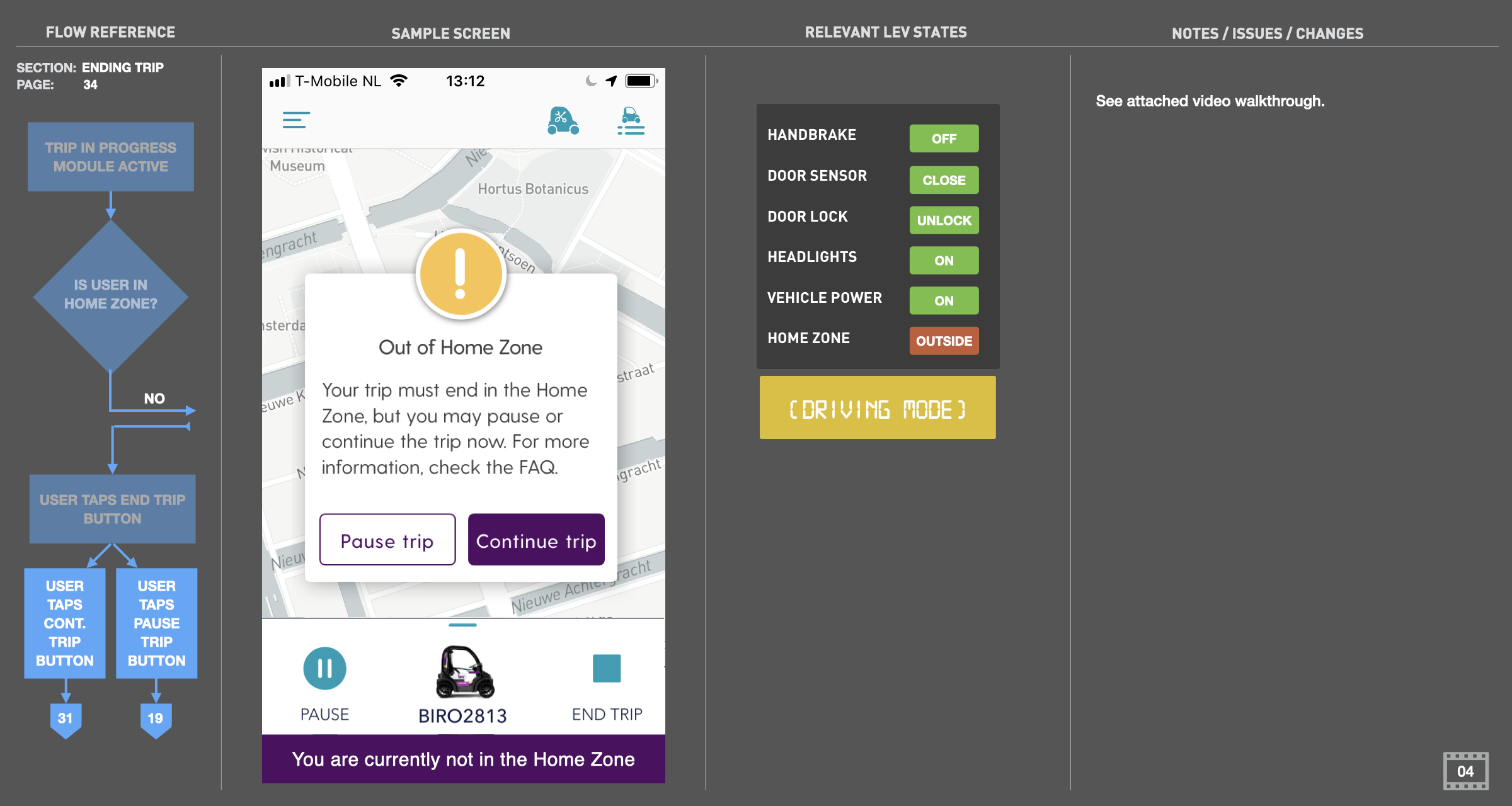
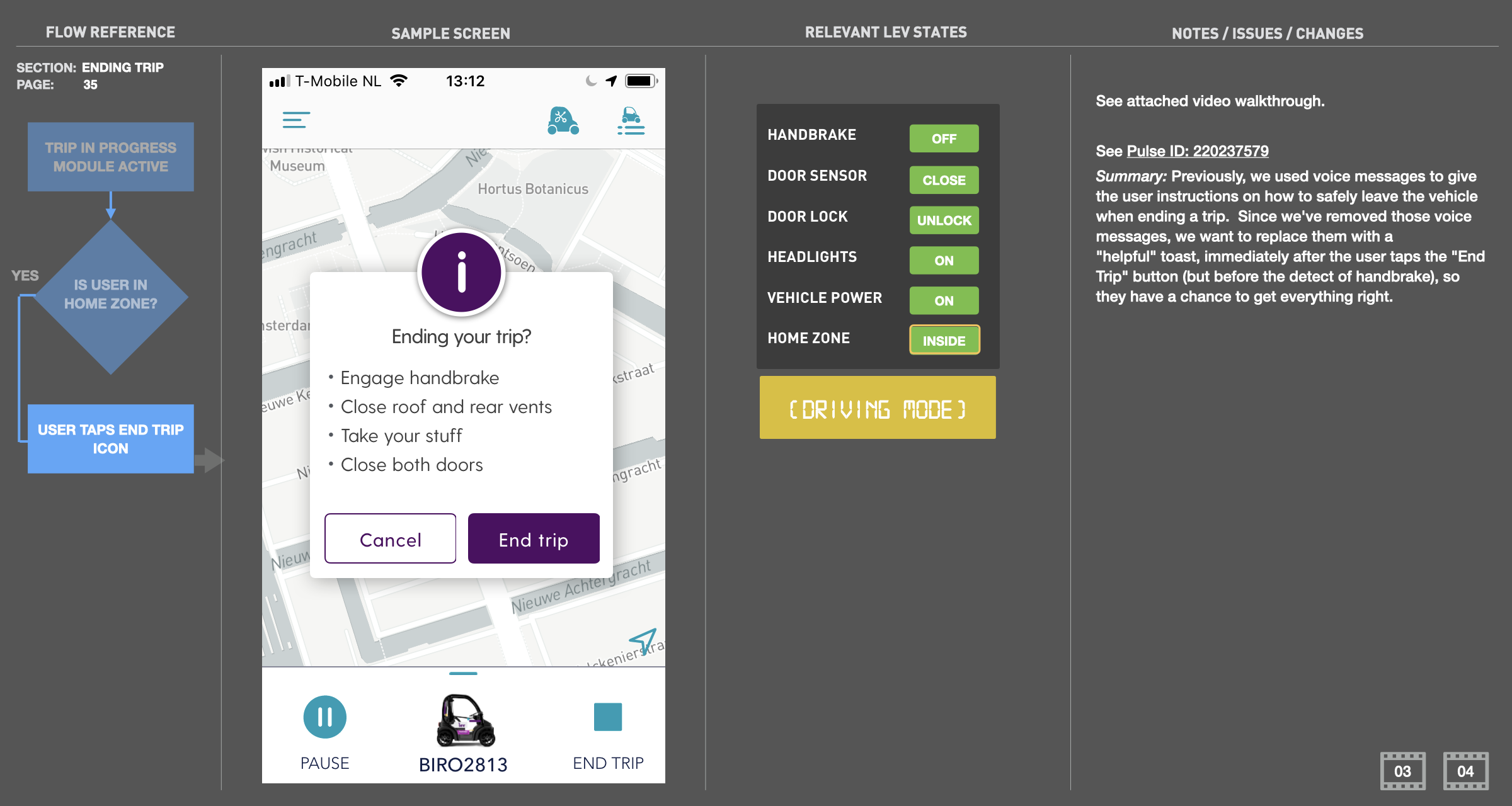
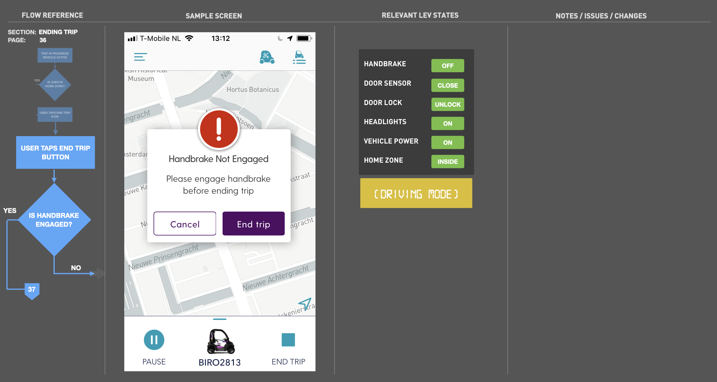
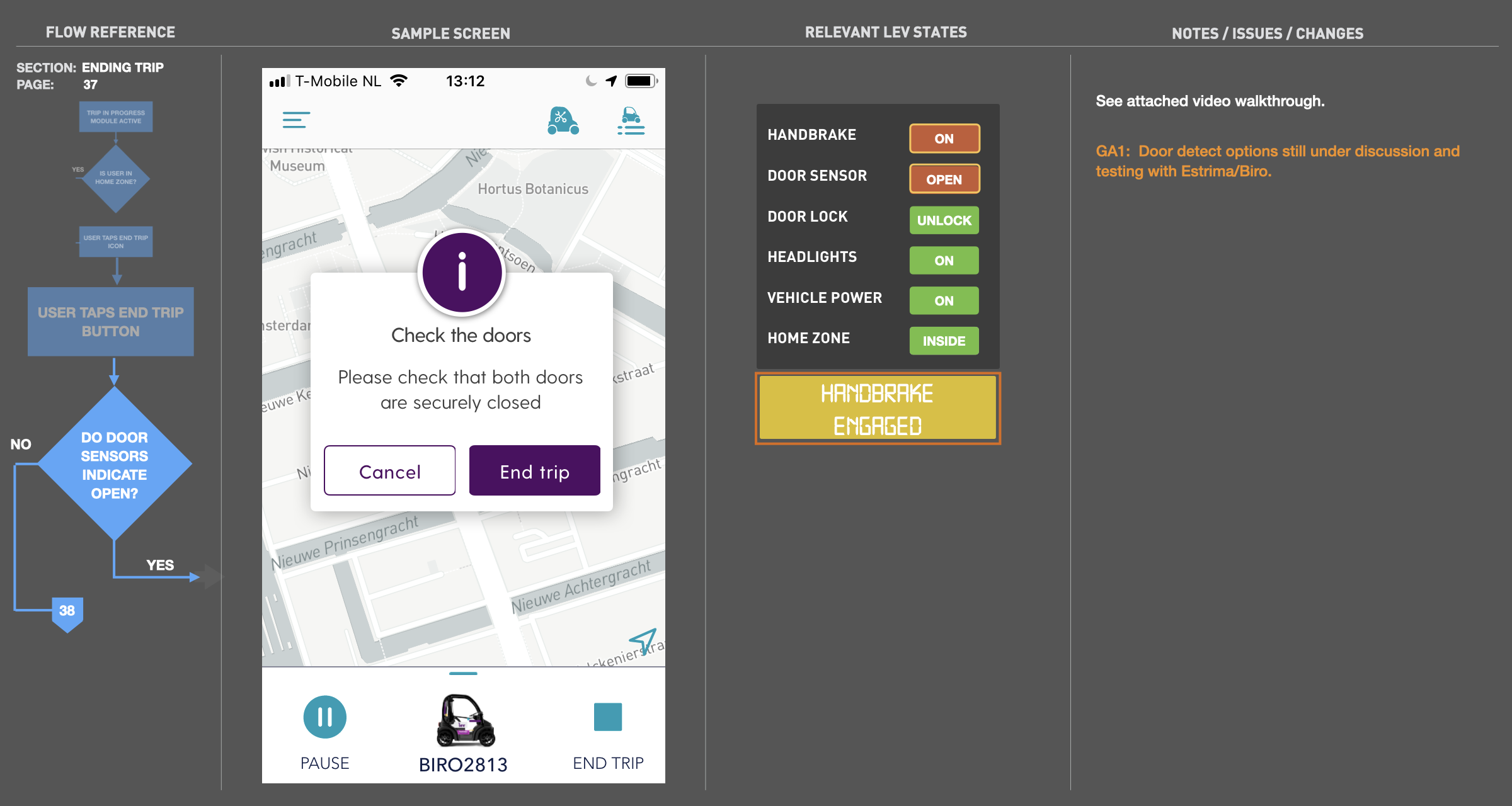
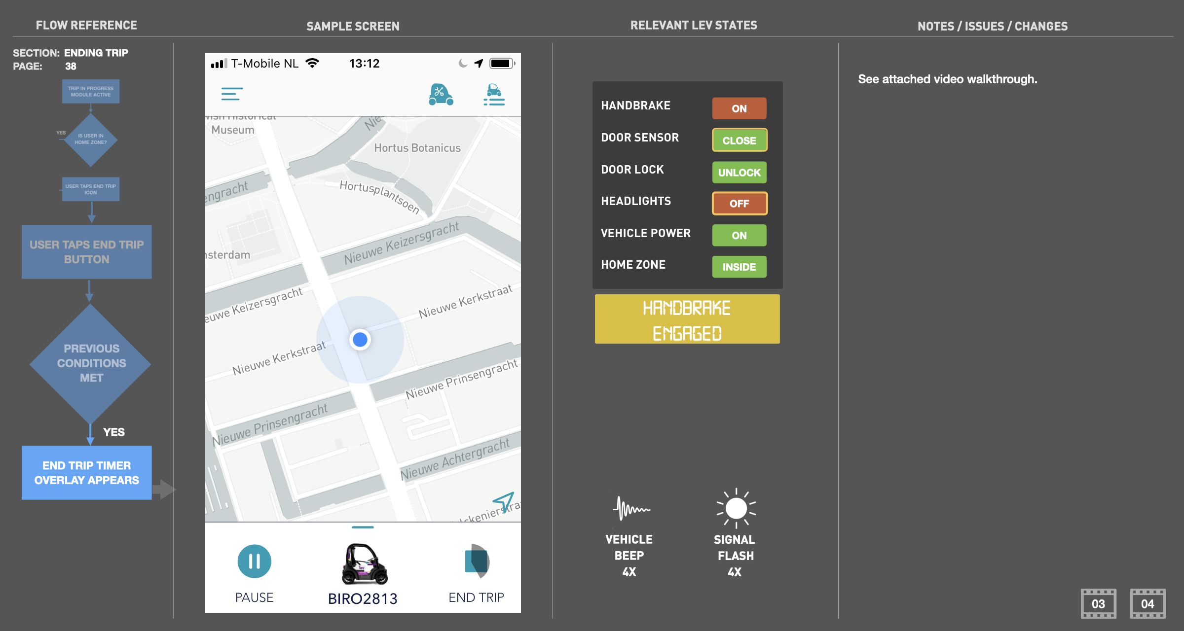
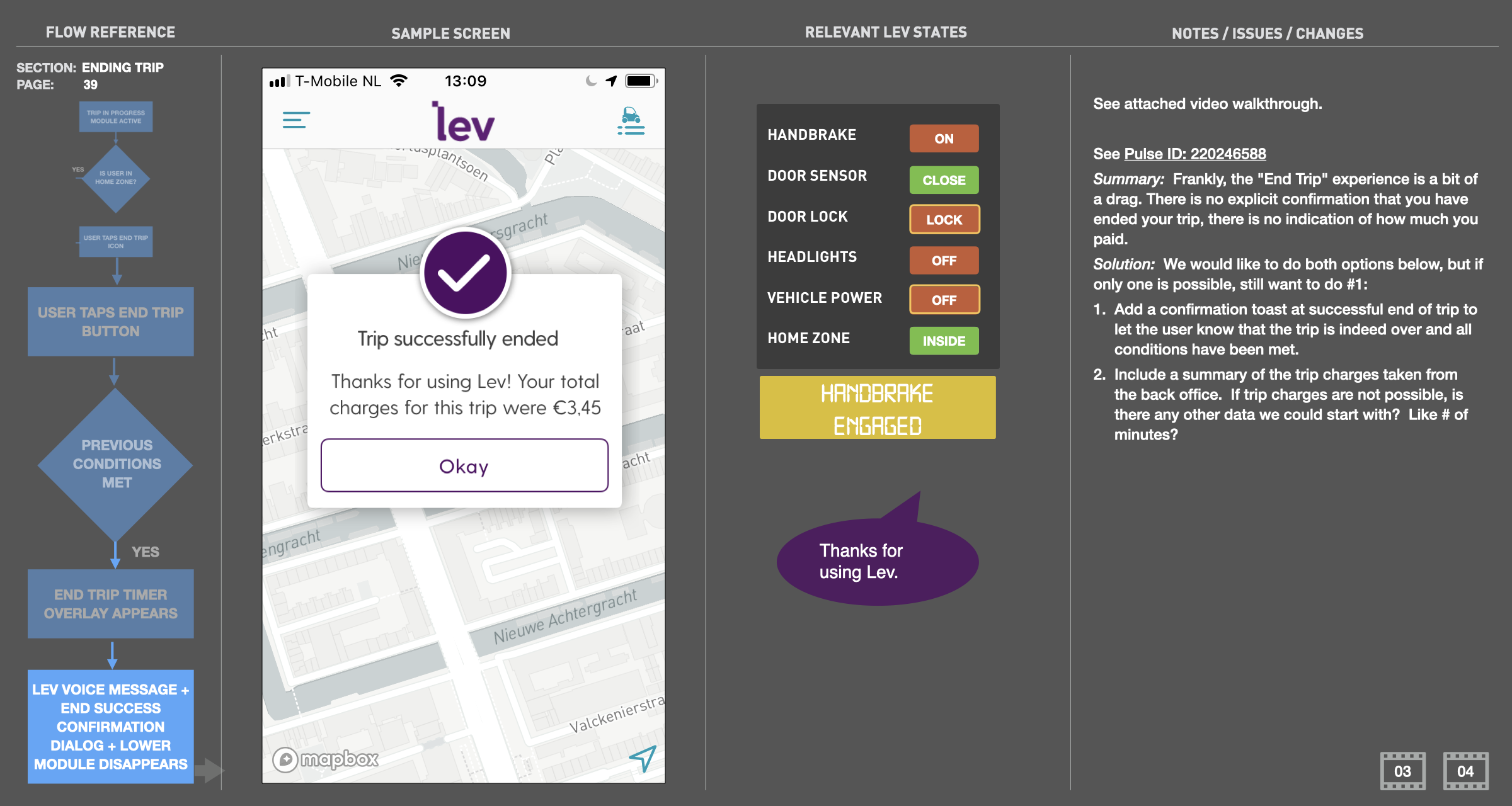
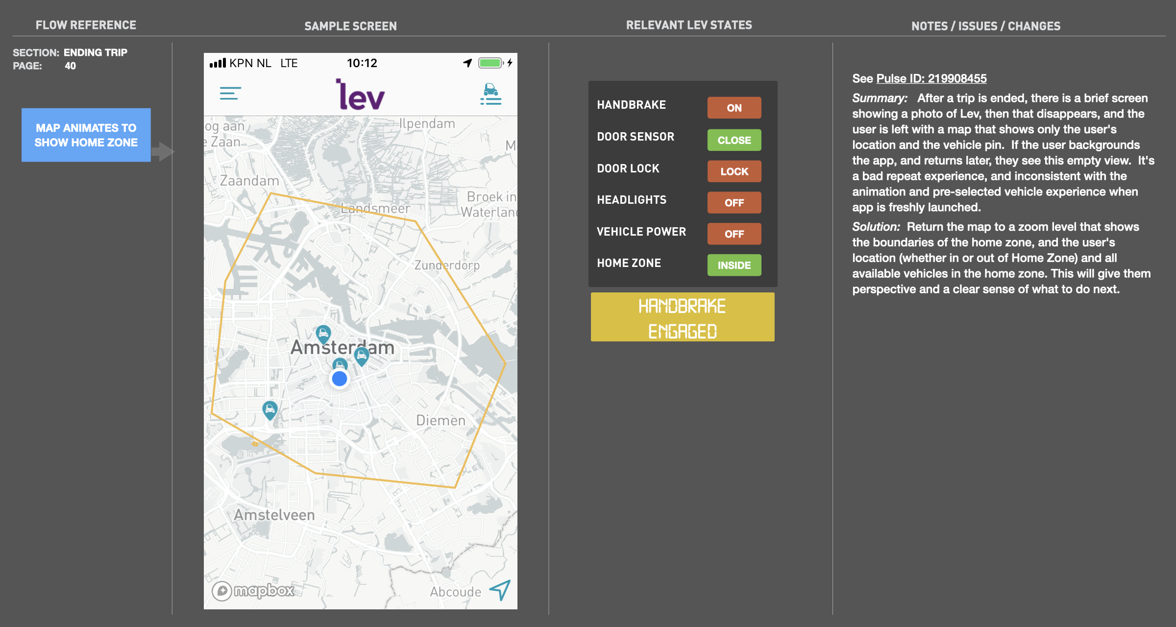
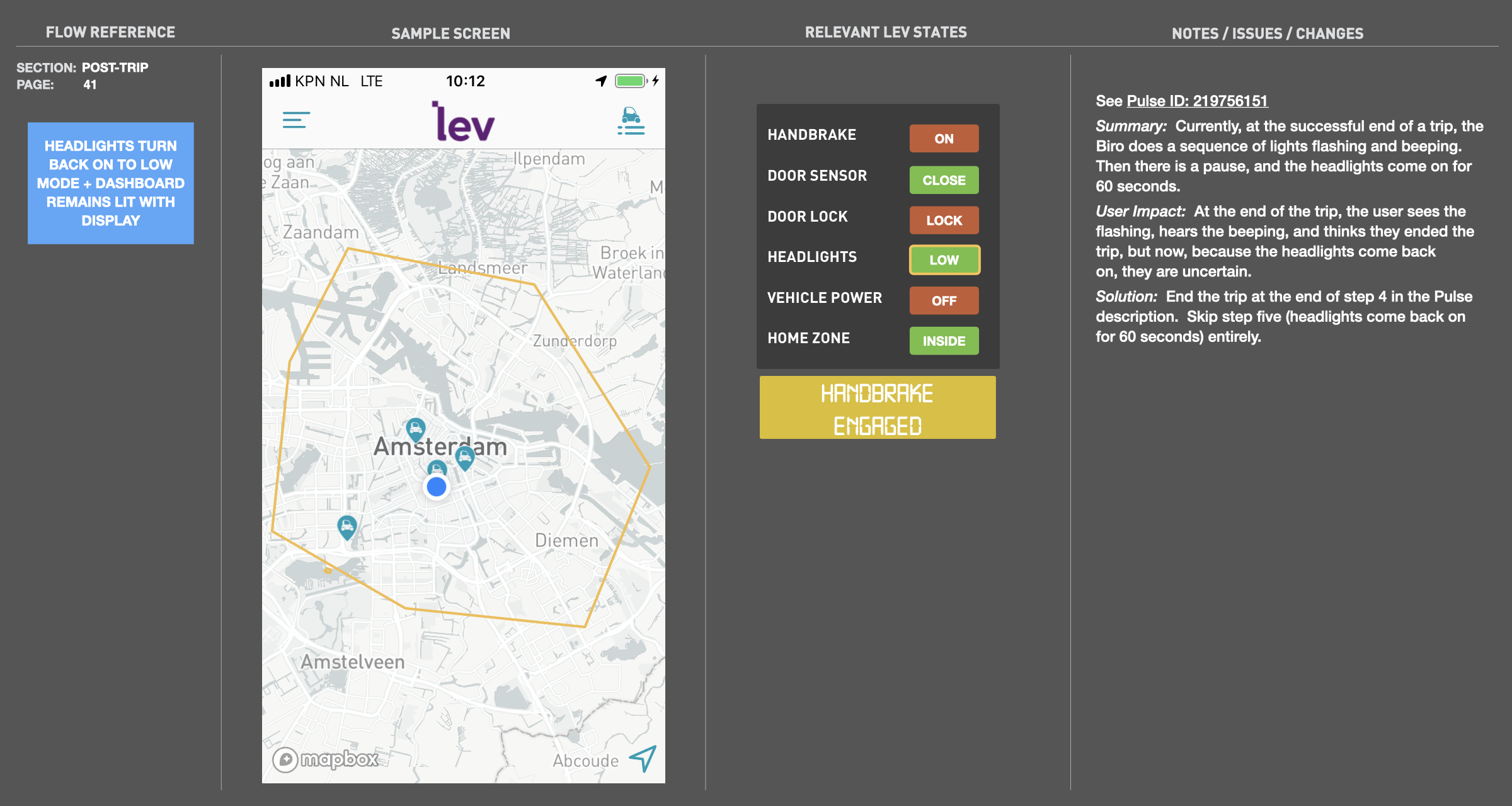
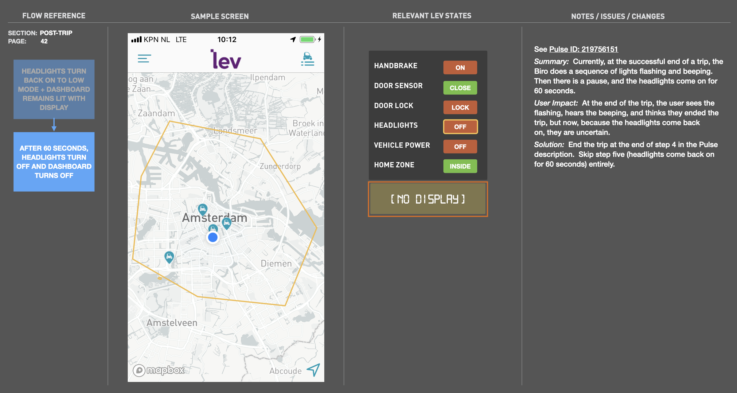
One of my first projects after joining was to integrate the user experience of both the mobile app and the behaviors of the vehicle, and how they were all integrated. I built this interactive Keynote file to map all of these states (app, vehicle locks, display, sounds, safety, etc.) together so we could see what needed to take place at what point in the flow. The document also provided a place for notes and issues related to specific conditions and scenarios,


15-second instagram ad
15 second spot I produced for first ad campaign on Instagram, hence the square aspect ratio. Footage was acquired by outside contractor. I chose the royalty-free music, edited the footage and created the closing CTA motion graphics. Given that this was on a social media feed, I wanted to opening frame to be compositionally imperfect to catch the eye.
TOWARDS A CREATIVE BRIEF
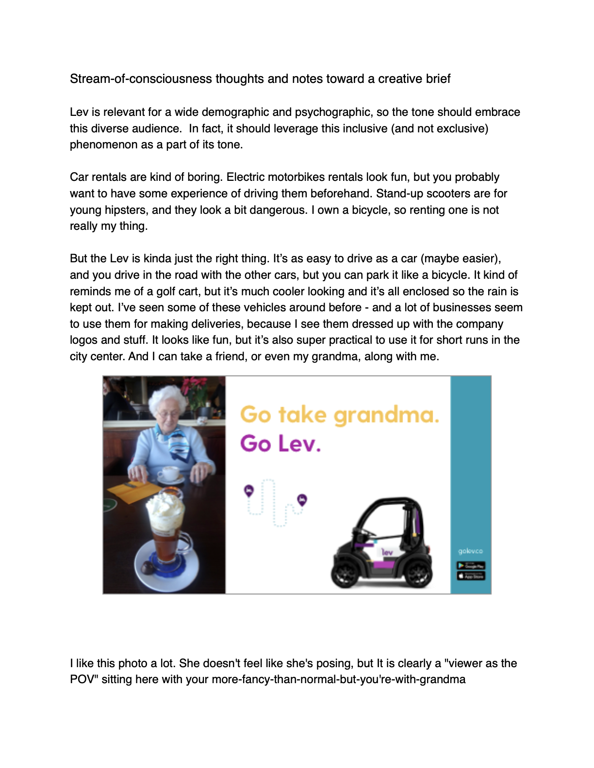
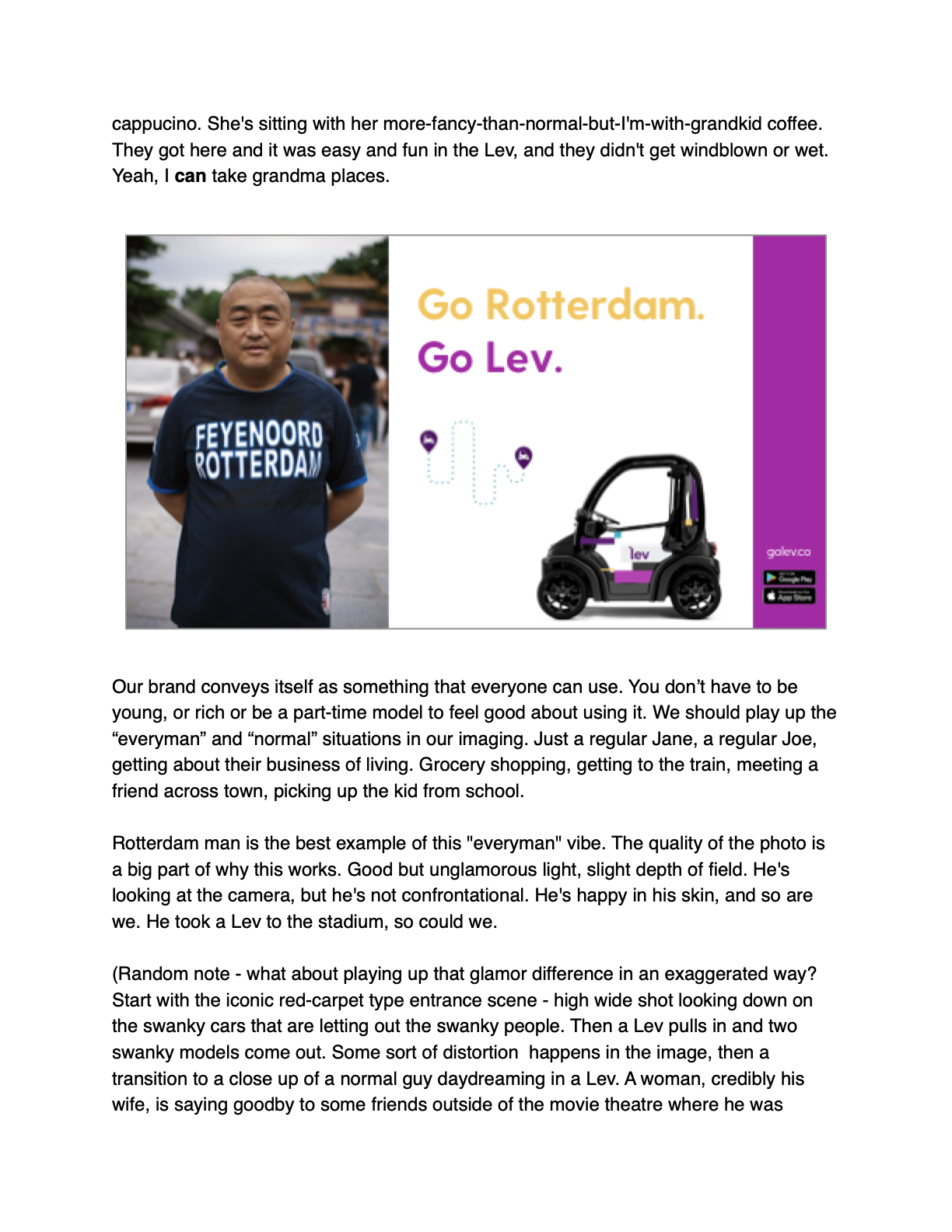
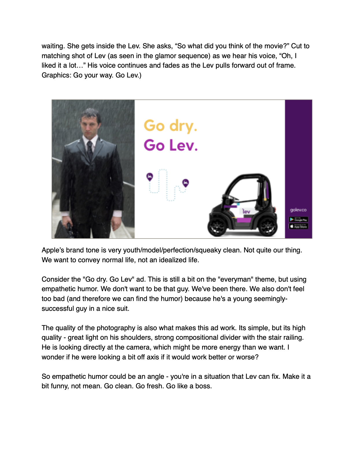
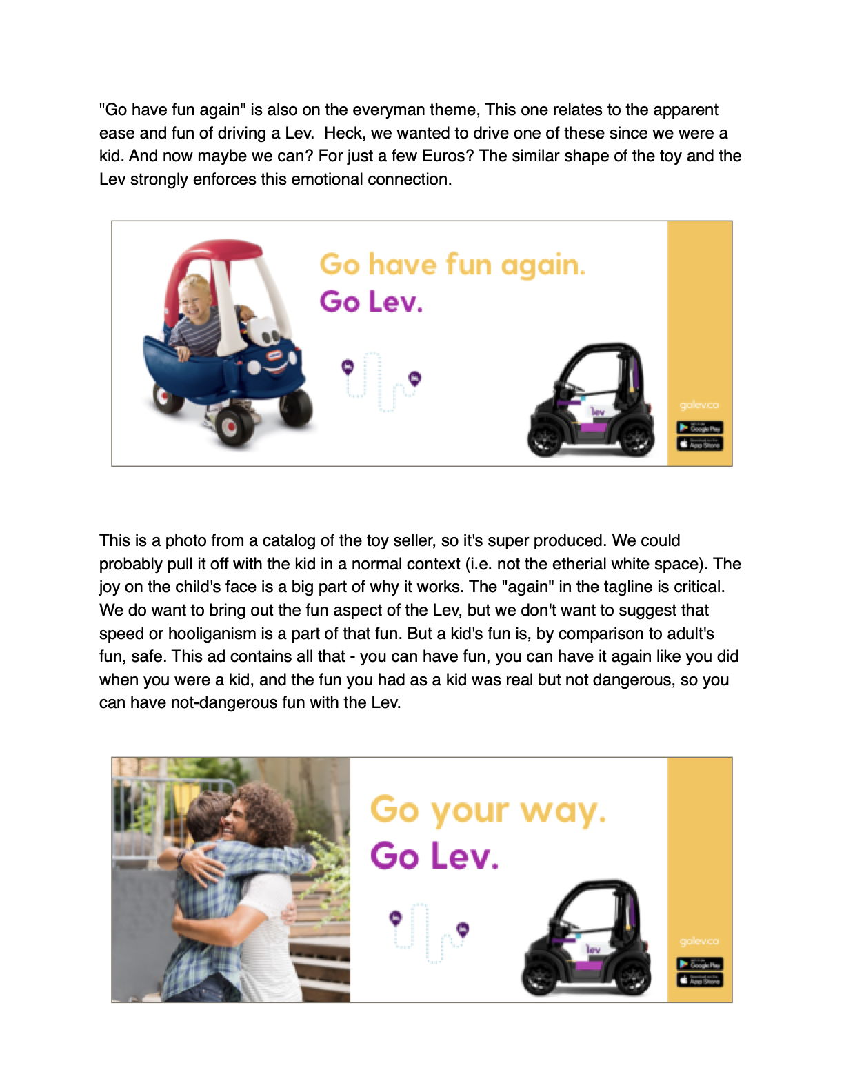
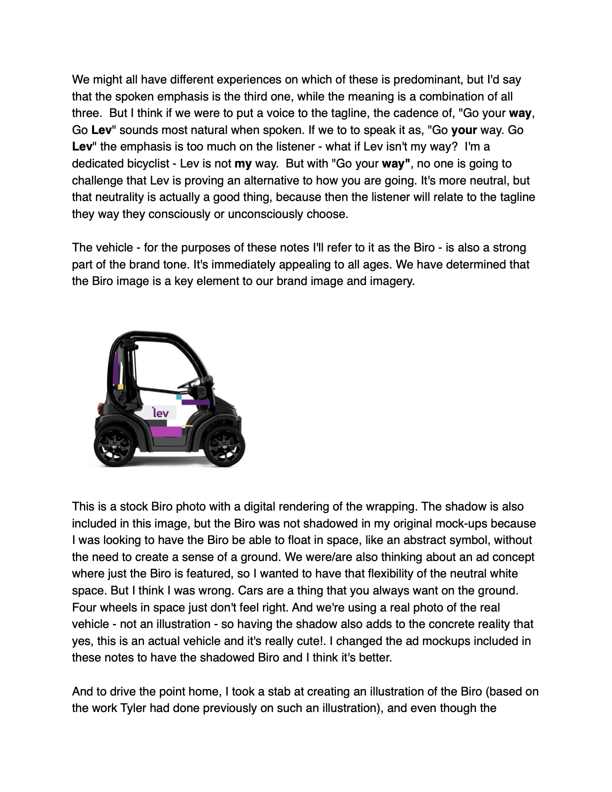
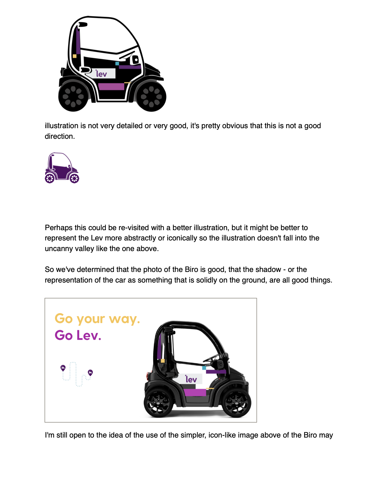
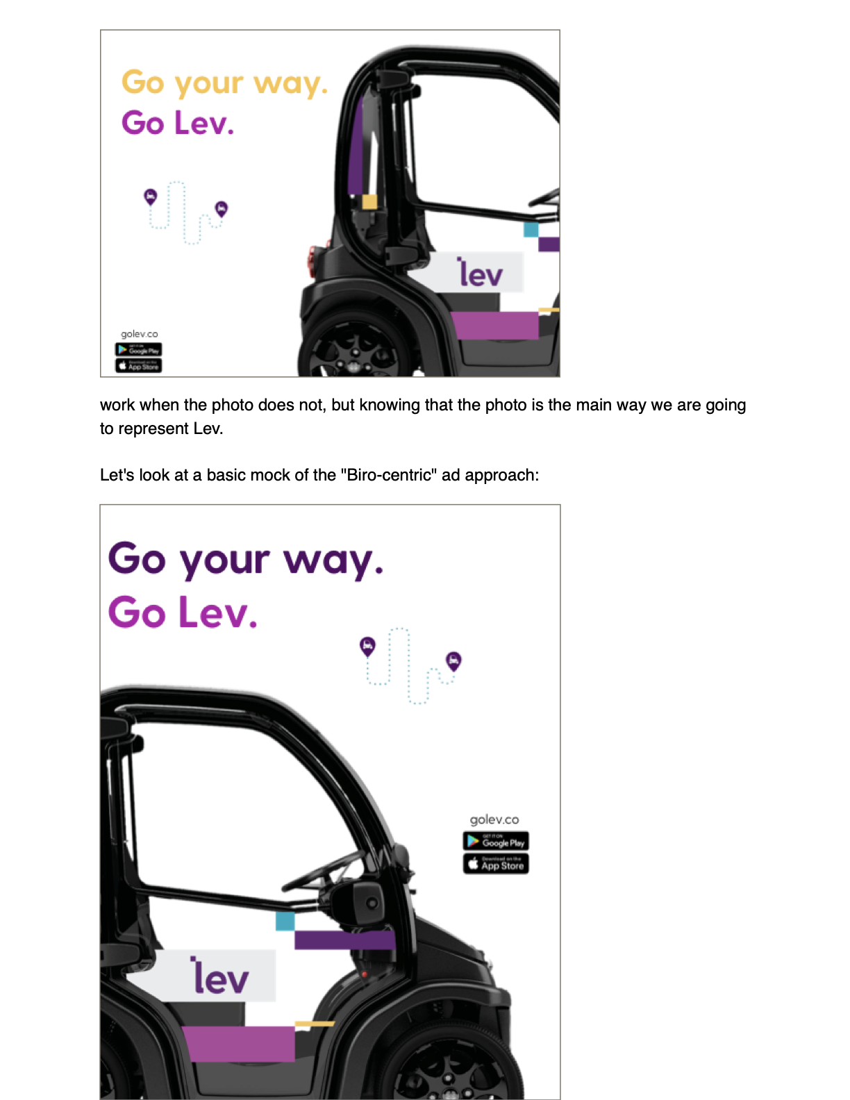
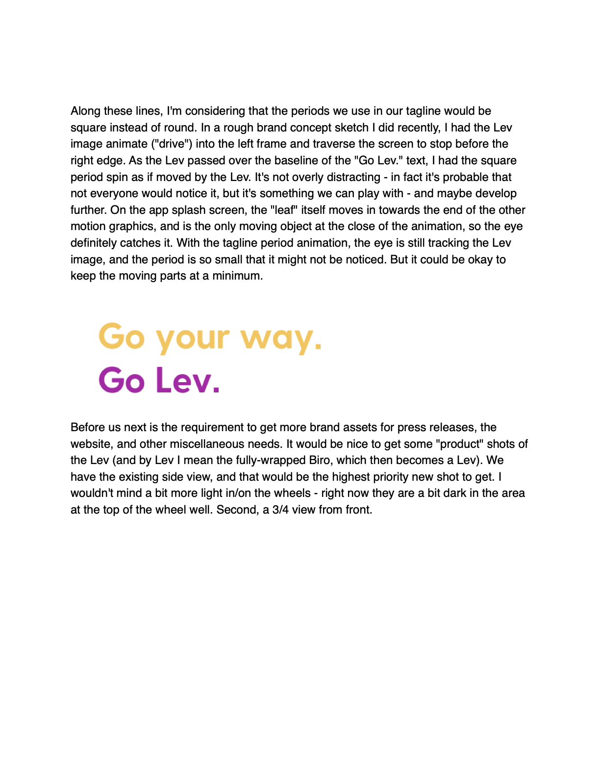
Casual internal document I made to start to articulate the brand "feeling" of Lev. The theme of the brief revolved around my rip-o-matically-derived print ad campaign concepts. We were also testing out the tagline "Go your Way" to see if it felt like a fit. I didn't think it did, as I felt it was too vague for a brand new product/service category. We eventually settled on the more direct lines shown at the end of the Instagram spot (included in this set of examples).

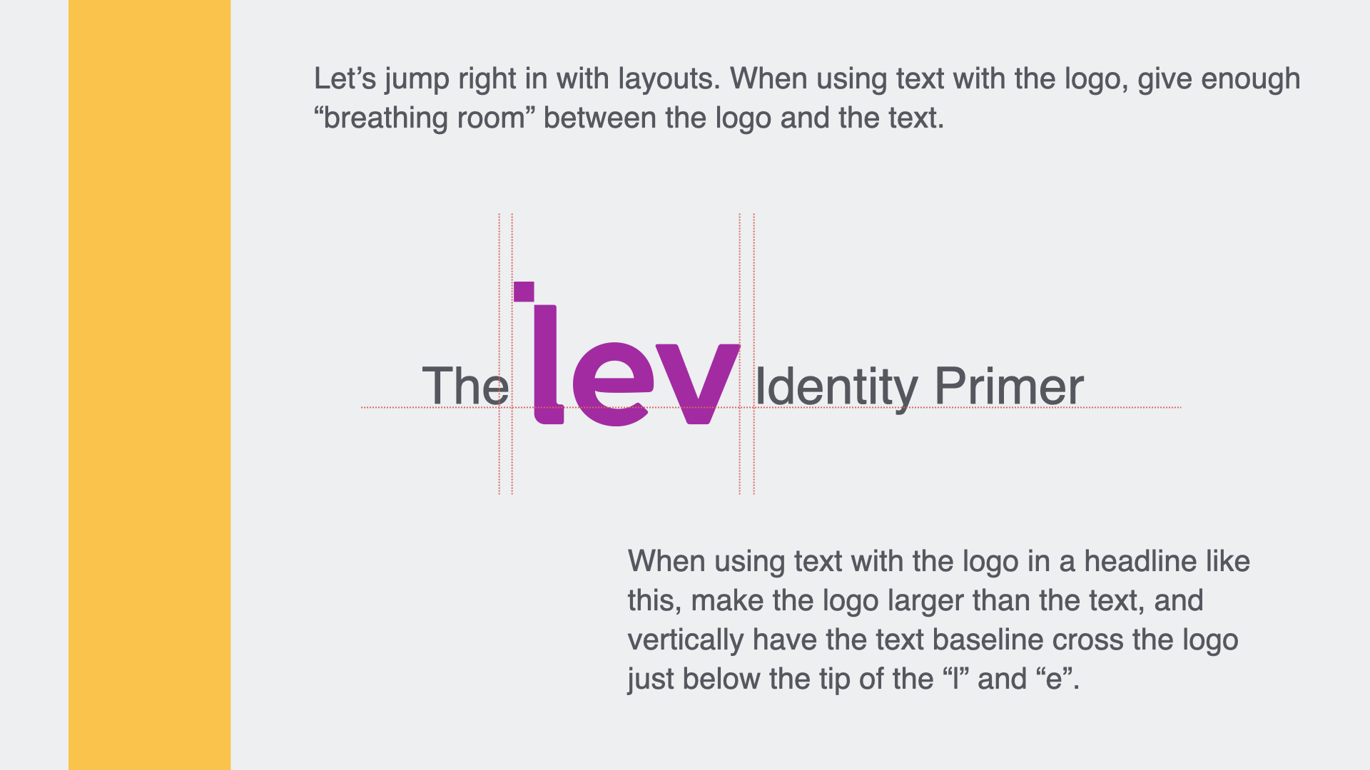
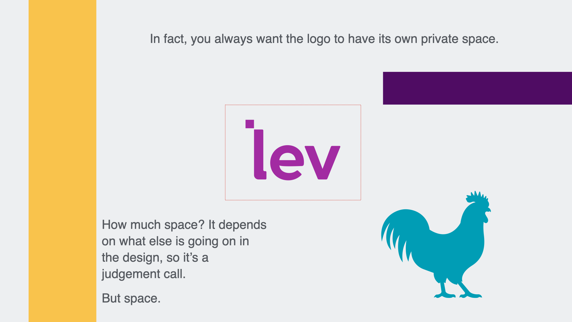
Identity Primer
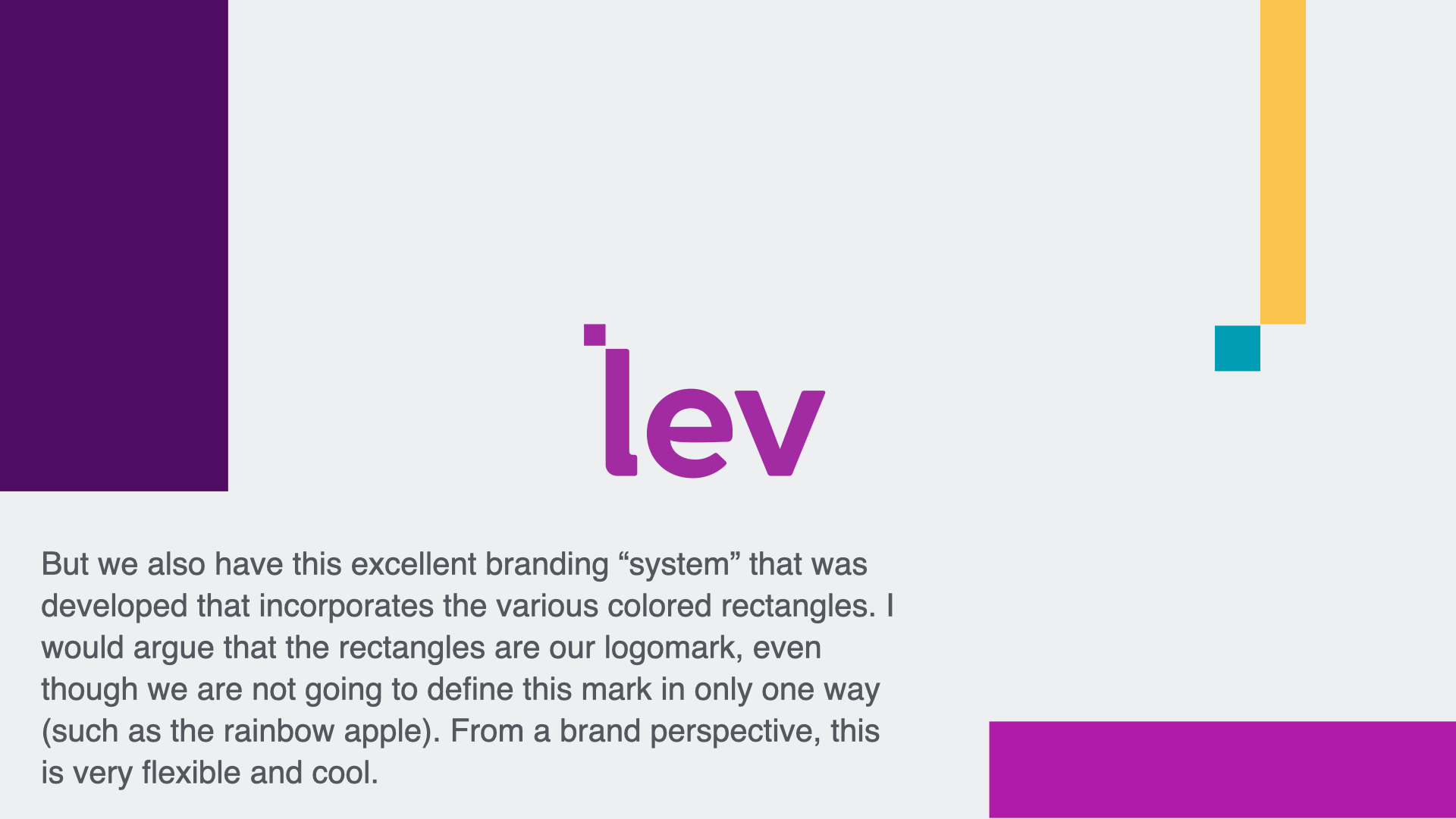
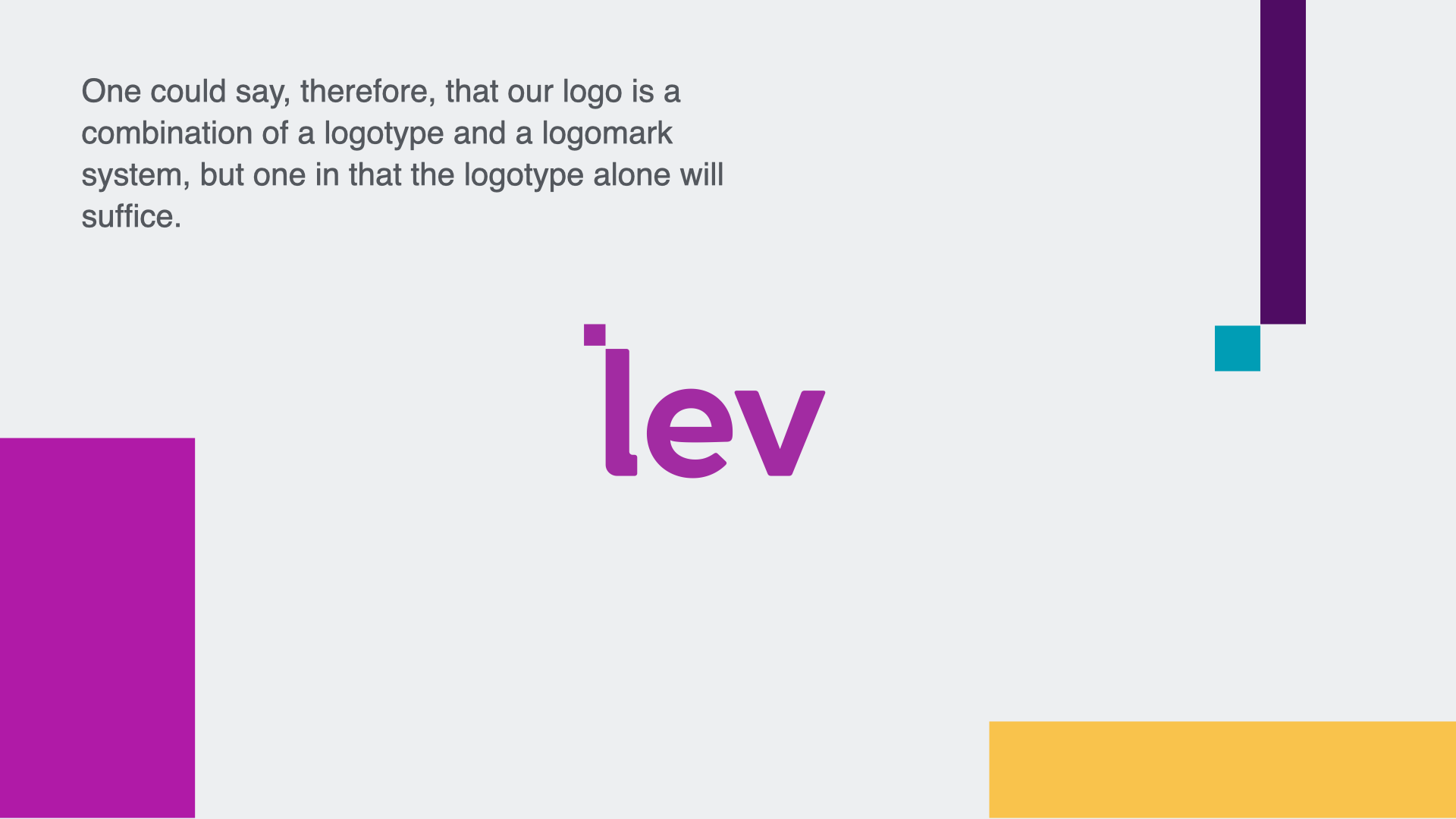
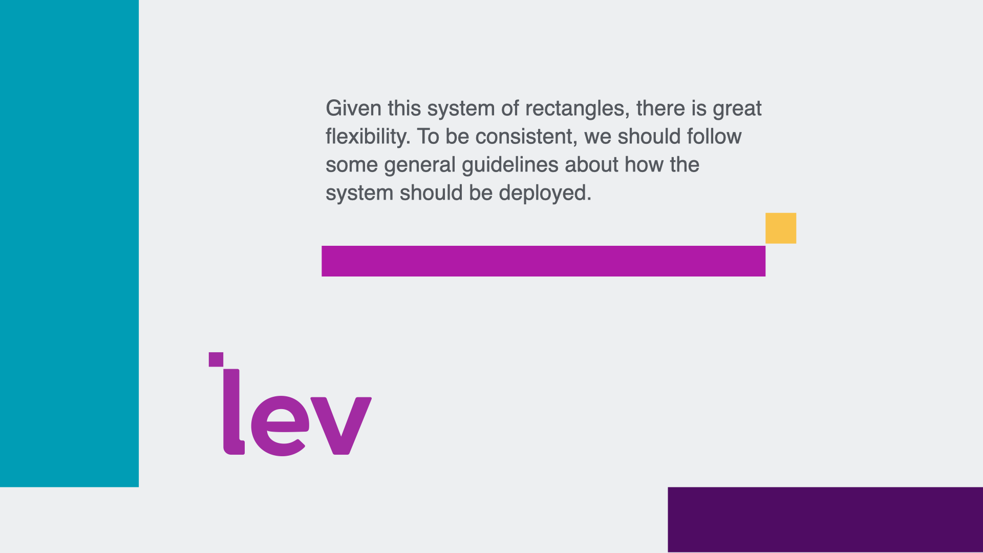
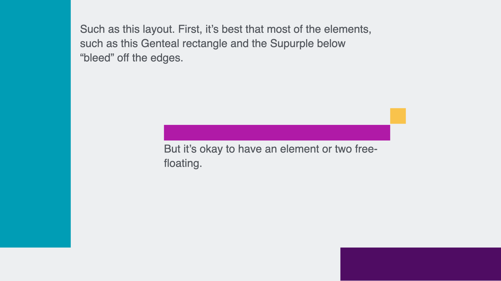
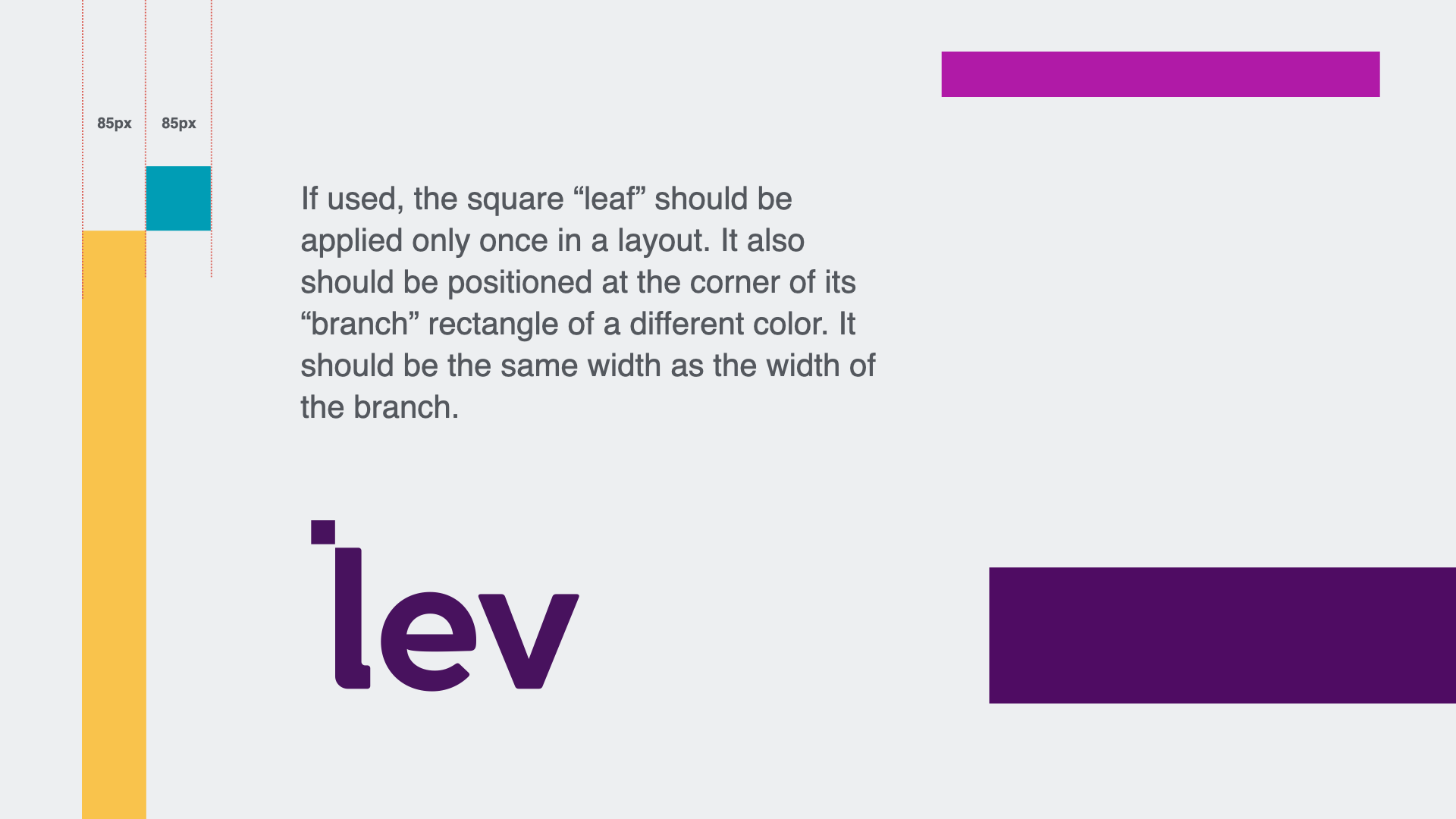
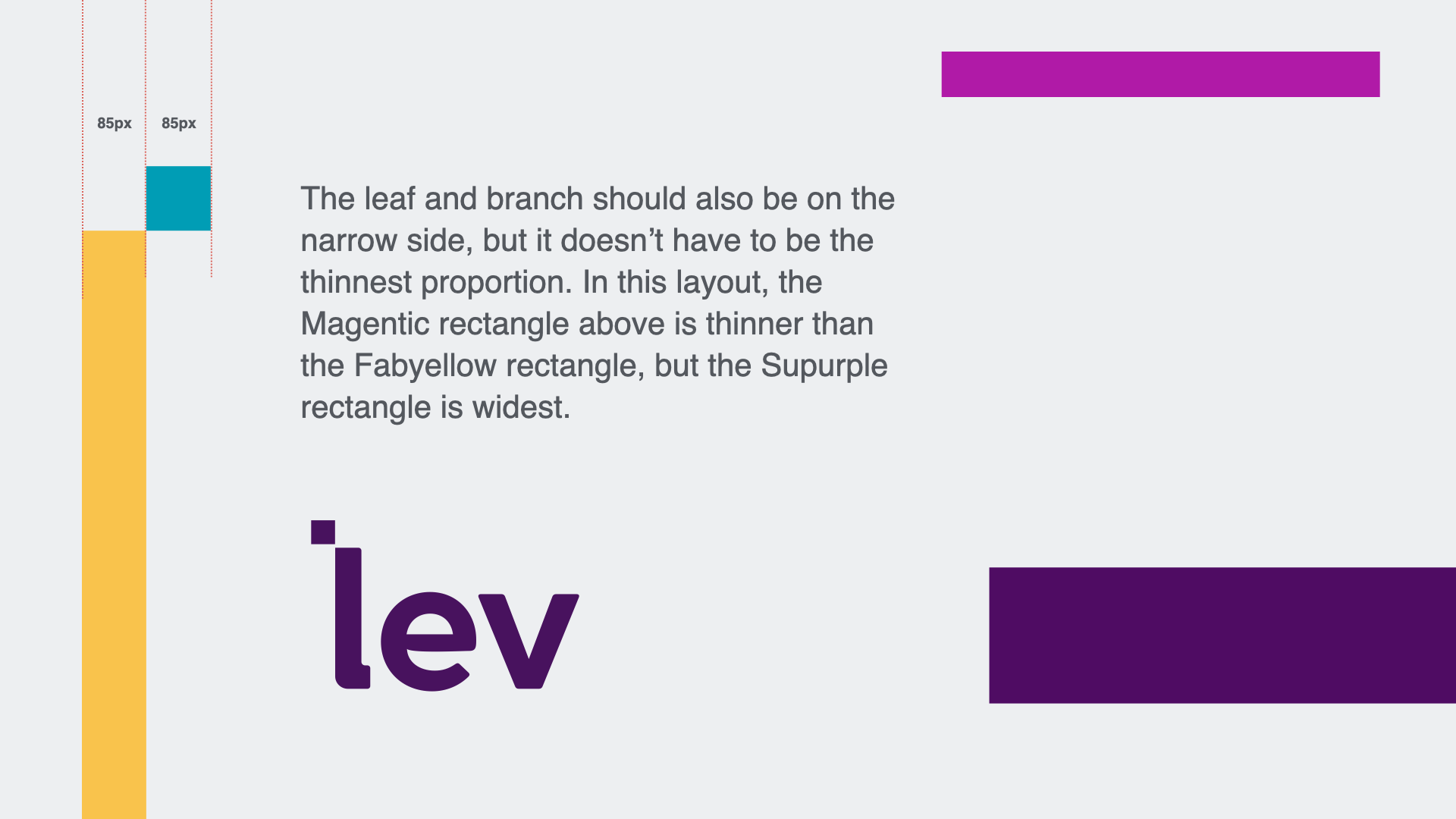
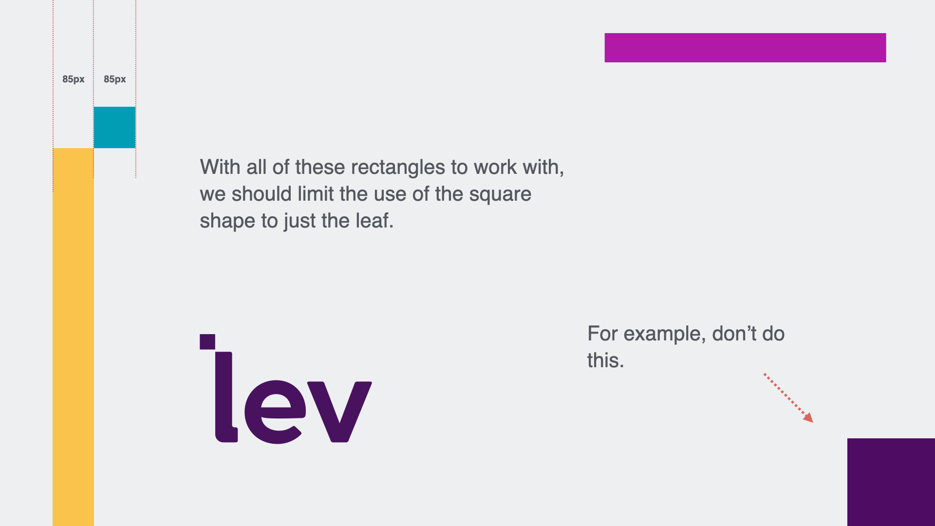
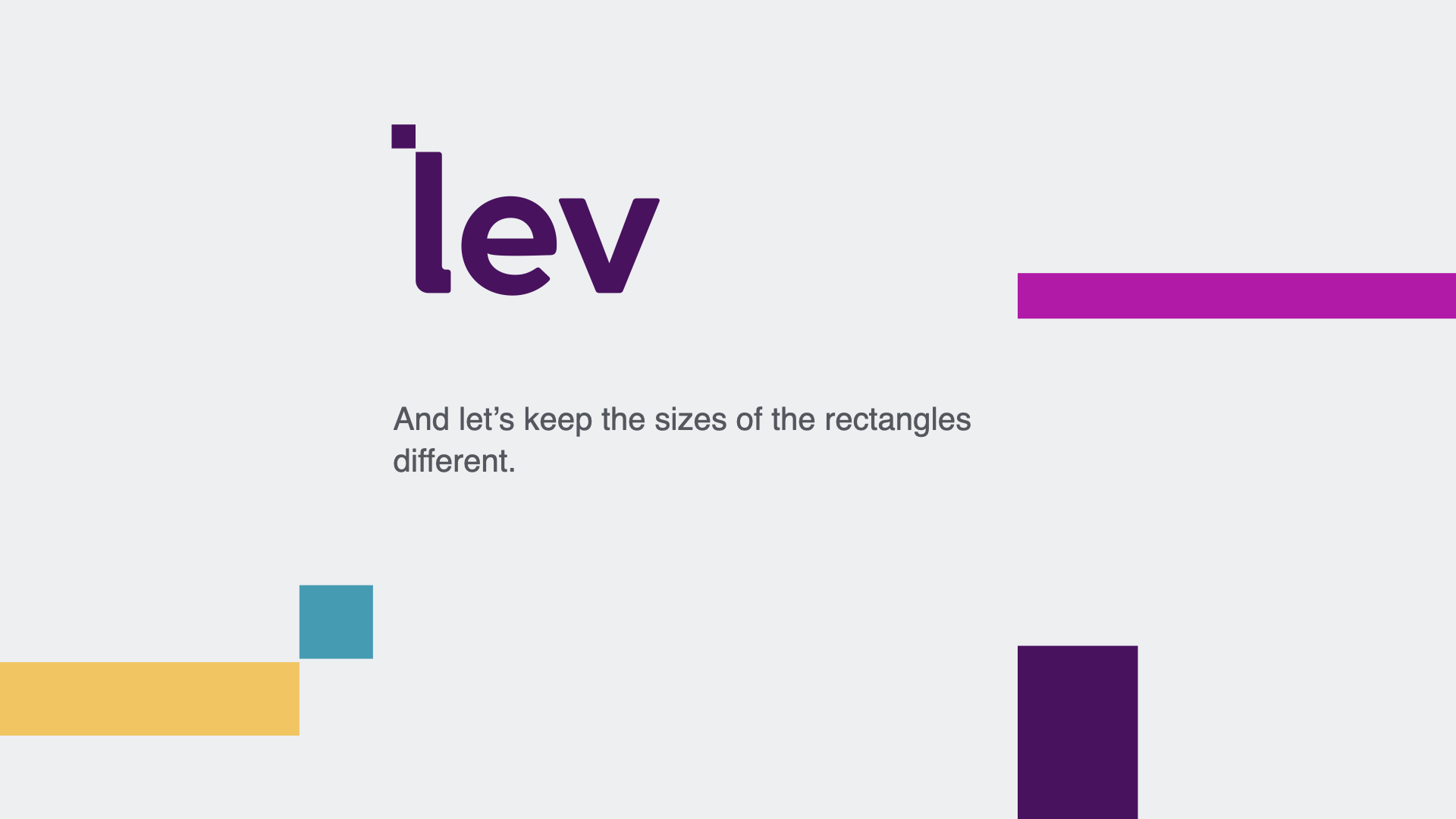
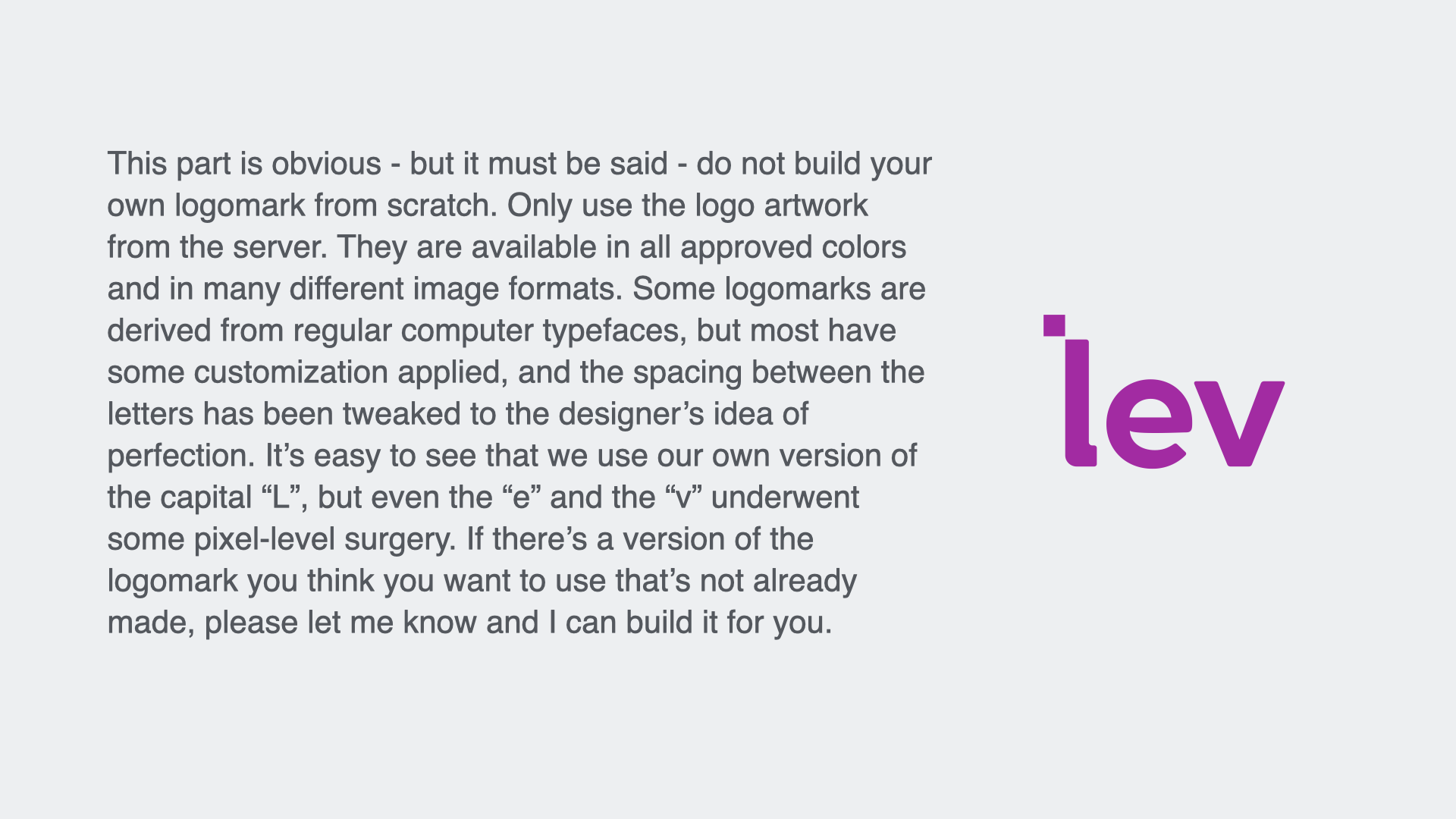
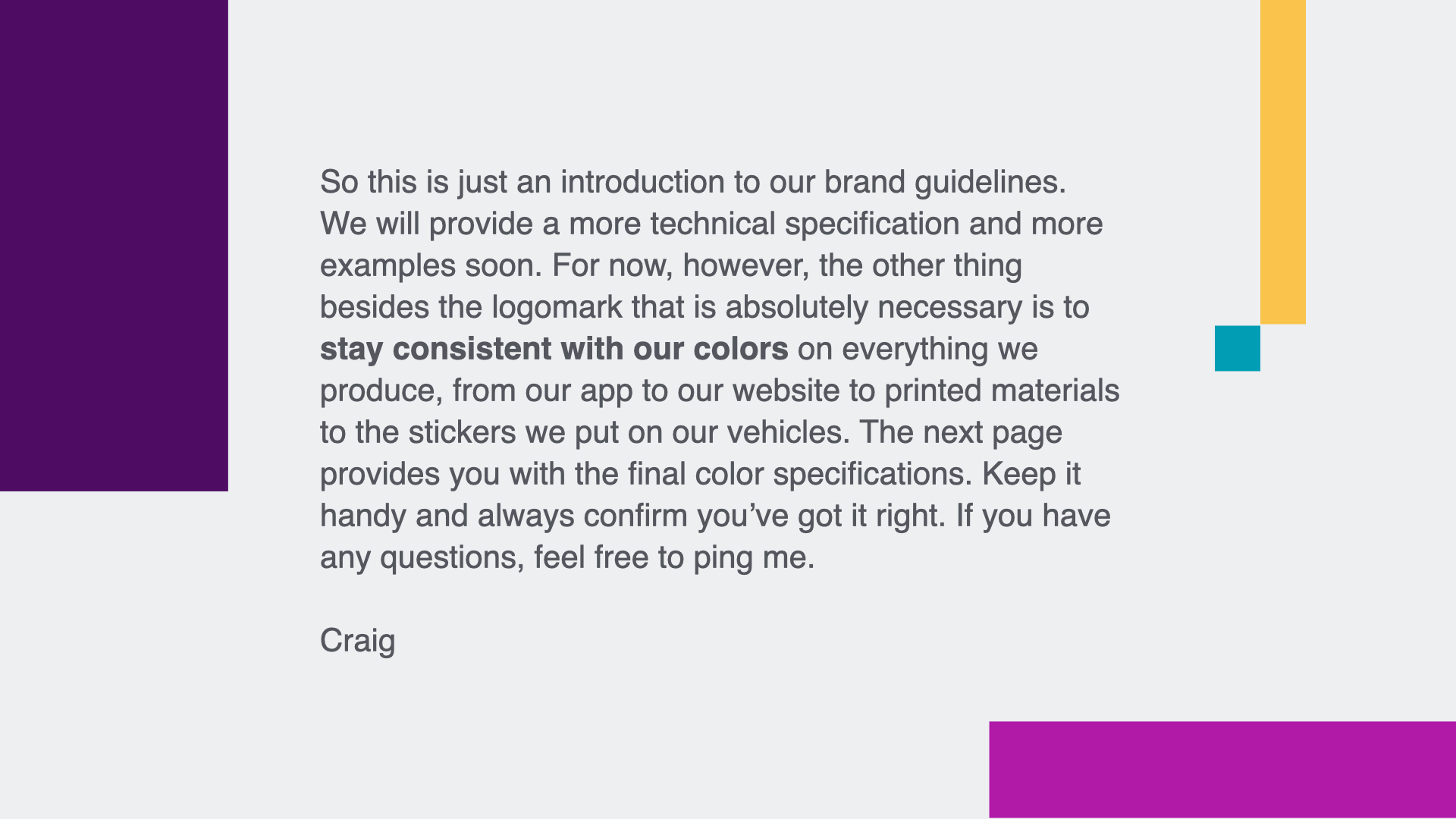
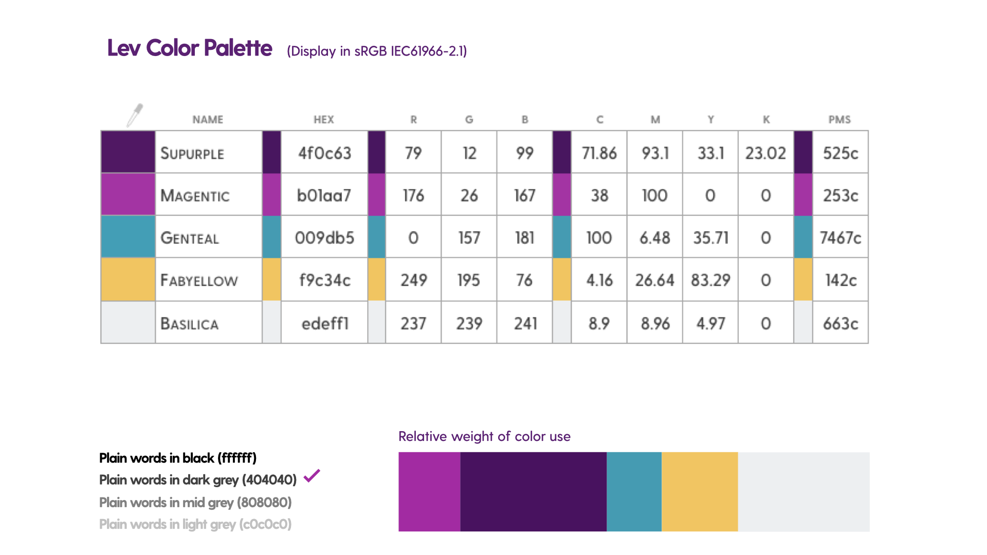
Internal document I made to quickly introduce some corporate identity guidelines to all team members before things could get out of hand.


brand animation standard / App splash screen
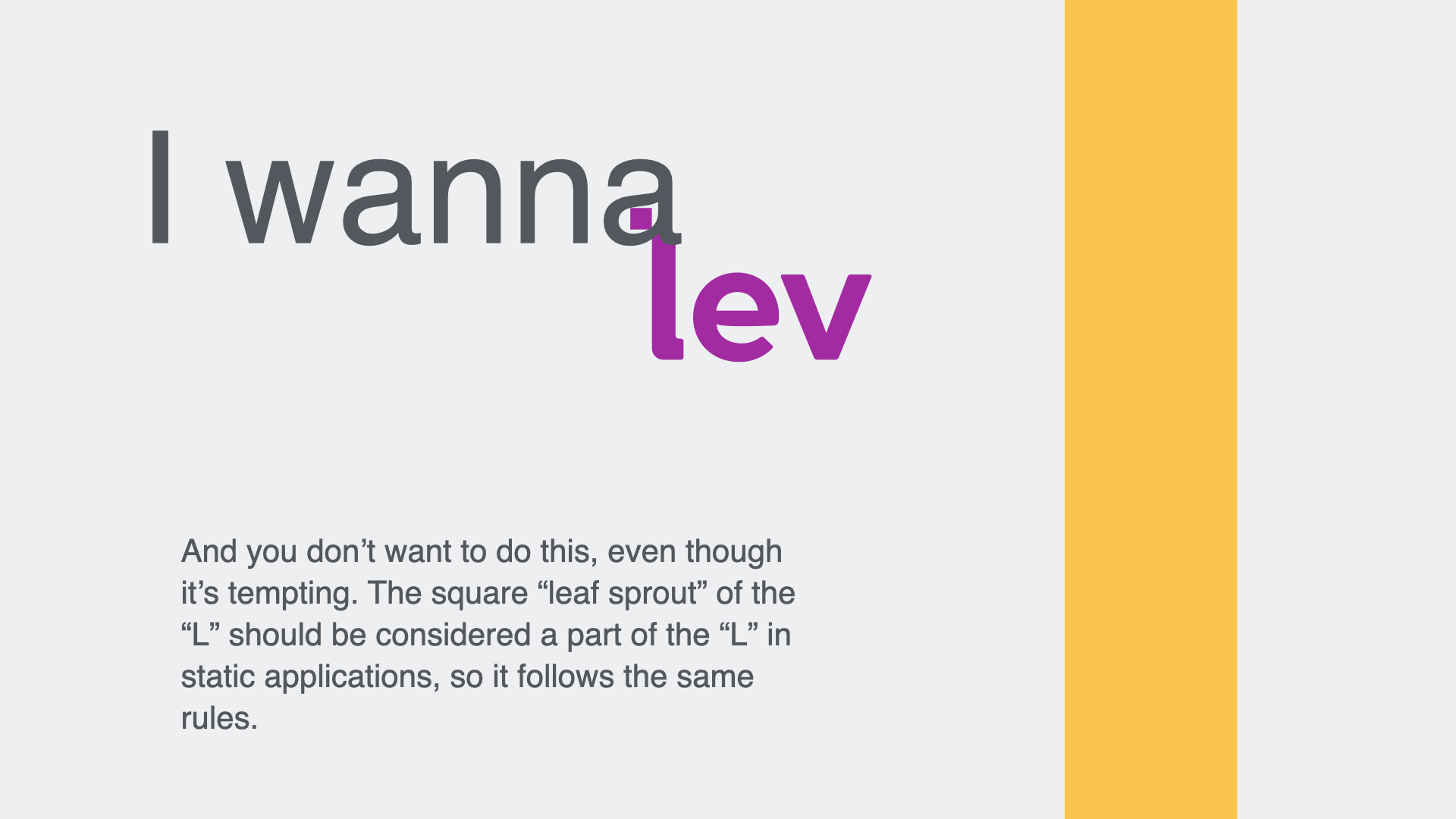
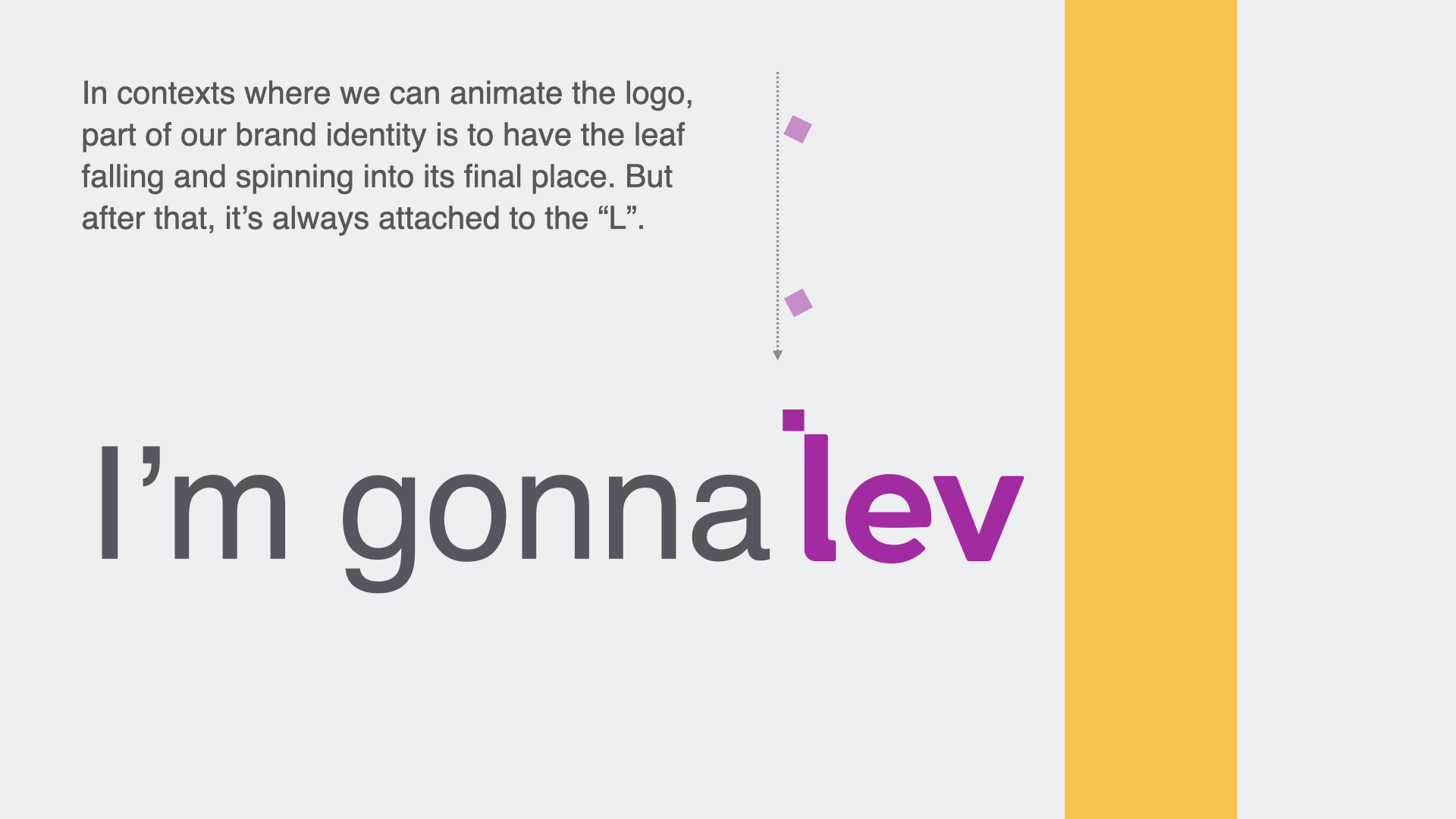
As mentioned in the creative brief document above, I established a simple identity animation standard for the logo that was first implemented on the splash screen for the mobile app. The square dot of the “L” drops from above, not unlike a leaf falling from a tree, and the Z-axis rotation gives it a sense of a wheel movement, thereby encapsulating our brand promise of providing environmental mobility to the public.
This video will repeat the same animation sequentially three times for convenience.
MISCELLANEA - print proofs, branded gear, photo management
As is common for startup companies, especially those in the retail services space, there’s a good amount of print work that needs to be produced. This pre-press proof of business card-sized handouts is one example of many print projects I designed.
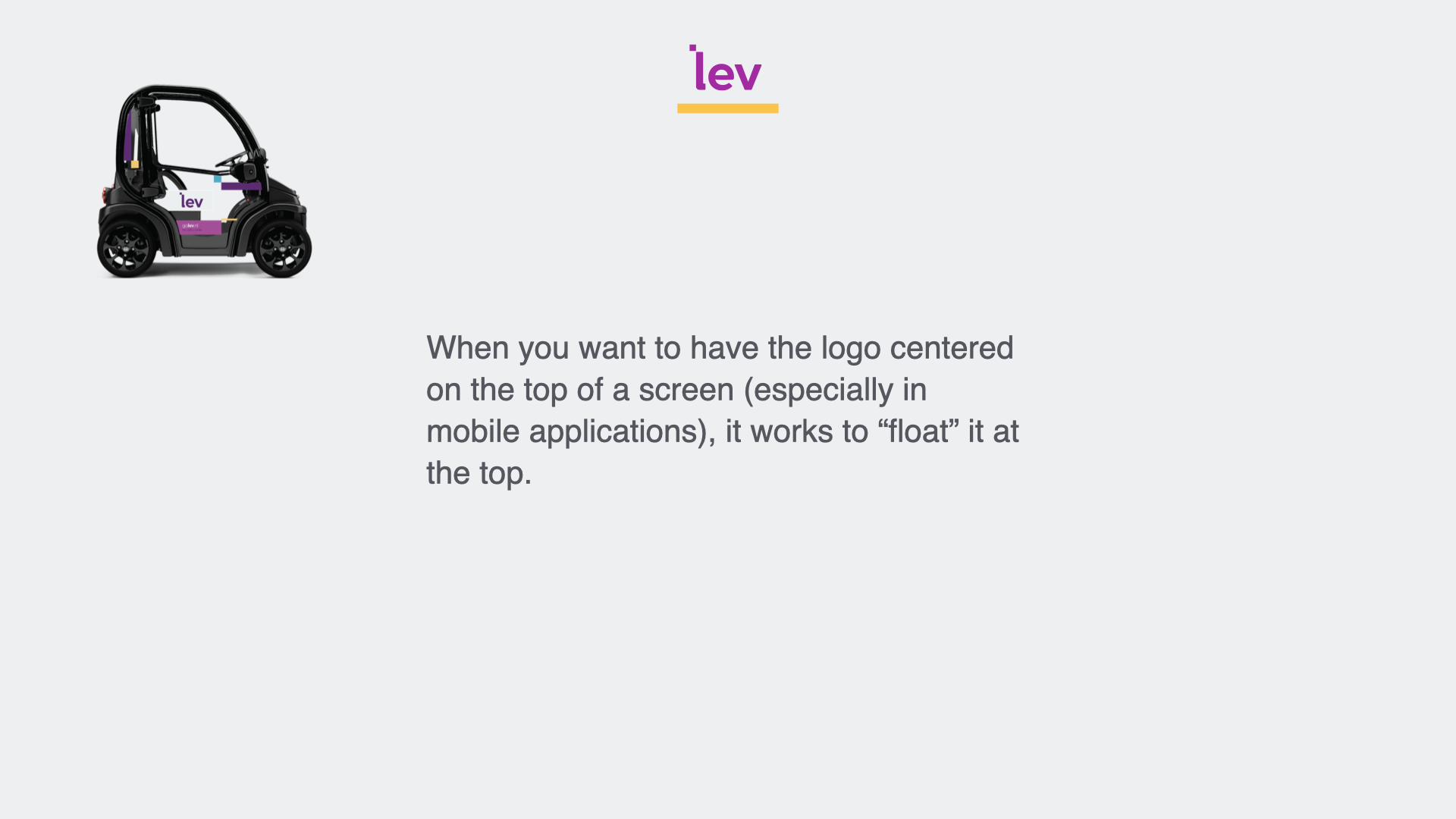
Rotterdam can have challenging weather at times (understatement). Our Fleet Maintenance crew - the team that goes out into the field every day to pick up cars for charging, do basic repairs, etc. needed some serious weather gear. I developed a basic branding standard for clothing, backpacks, etc. and interfaced with local vendors to produce them for the team, this rain jacket being one example.
Besides setting brand guidelines and preparing a digital asset library, I also observed the large number of photos that we were producing for various purposes. Imagining the team having the onerous task of trying to decipher my photography folder structure when I was away, I purchased Capture One as our photo management system (screenshot shown here). It was a good choice. I developed a keyword tagging protocol to manage the assets and a color-grading standard for those photos that required it.