Founding storytelling Lead | IDEO | 1995-2005
Palo Alto, CA
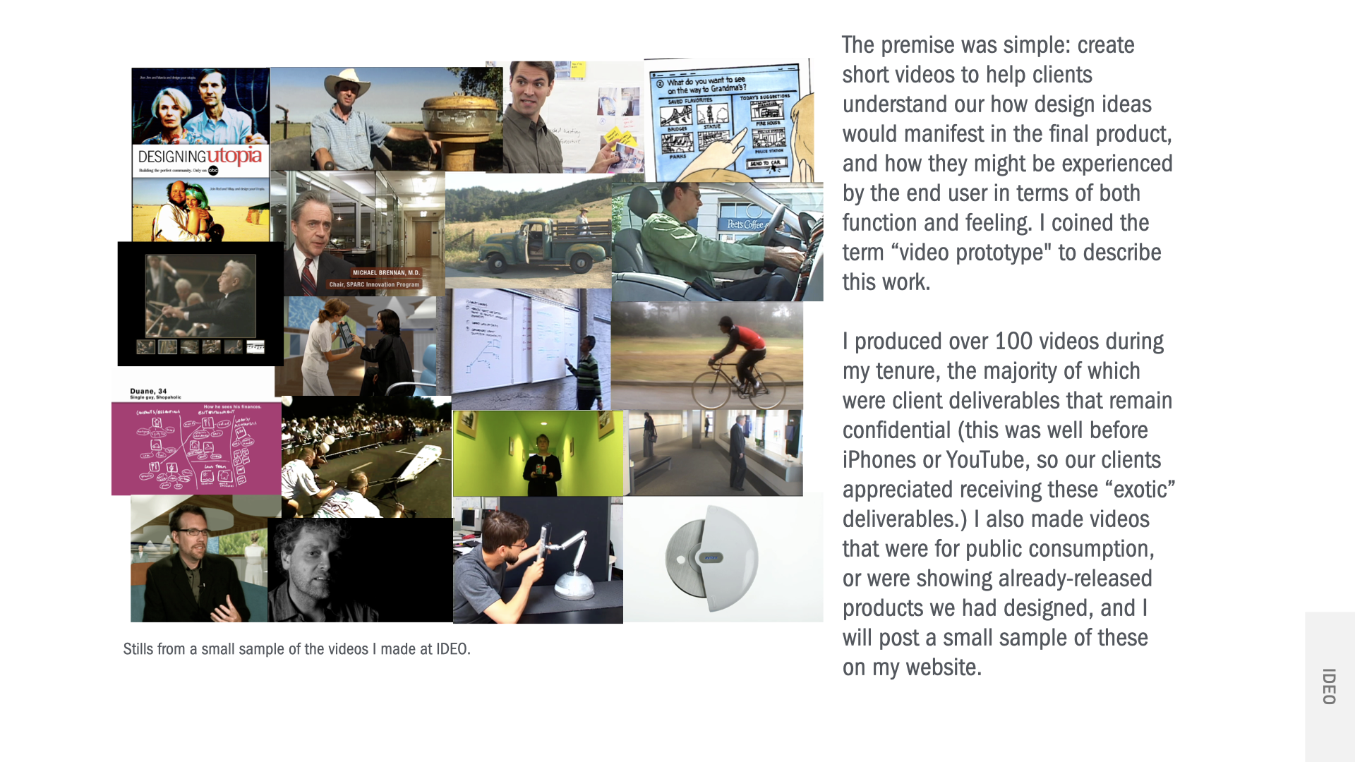
I conceived and lead IDEO's in-house media production division, which is currently called the Storytelling Discipline. We focussed on creating short videos to help clients understand our how design ideas would manifest in the final product, and how they might be experienced by the user in terms of both function and feeling. I coined the term “video prototype" to describe this work. While I managed group of videographers and an in-house production and photography studio, I also performed all aspects of video production, from concept to shooting to distribution.
I reported directly to CEO and kept the division in the black from the first year. Our group was also responsible for all internally-created media representations of IDEO and worked directly with the Marketing and Communications group on the strategic direction of the company brand. We also produced promotional videos for annual design awards competition, providing a key element that enabled IDEO to reach the #1 position every year.
The majority of the work I did was proprietary and for our clients only, so I cannot share them publicly. The videos examples below are from a small set of works that were either documents of finished client work or internal concepts without confidentiality restrictions.
Overview
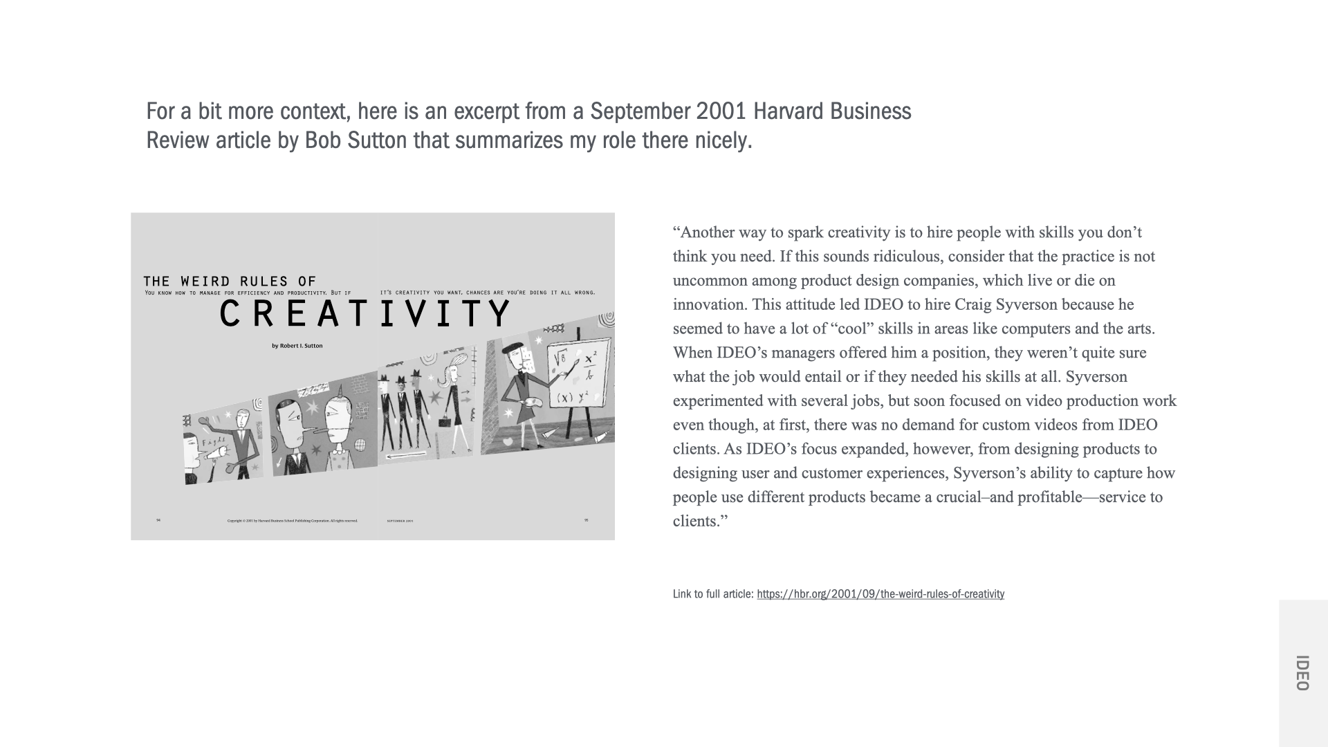
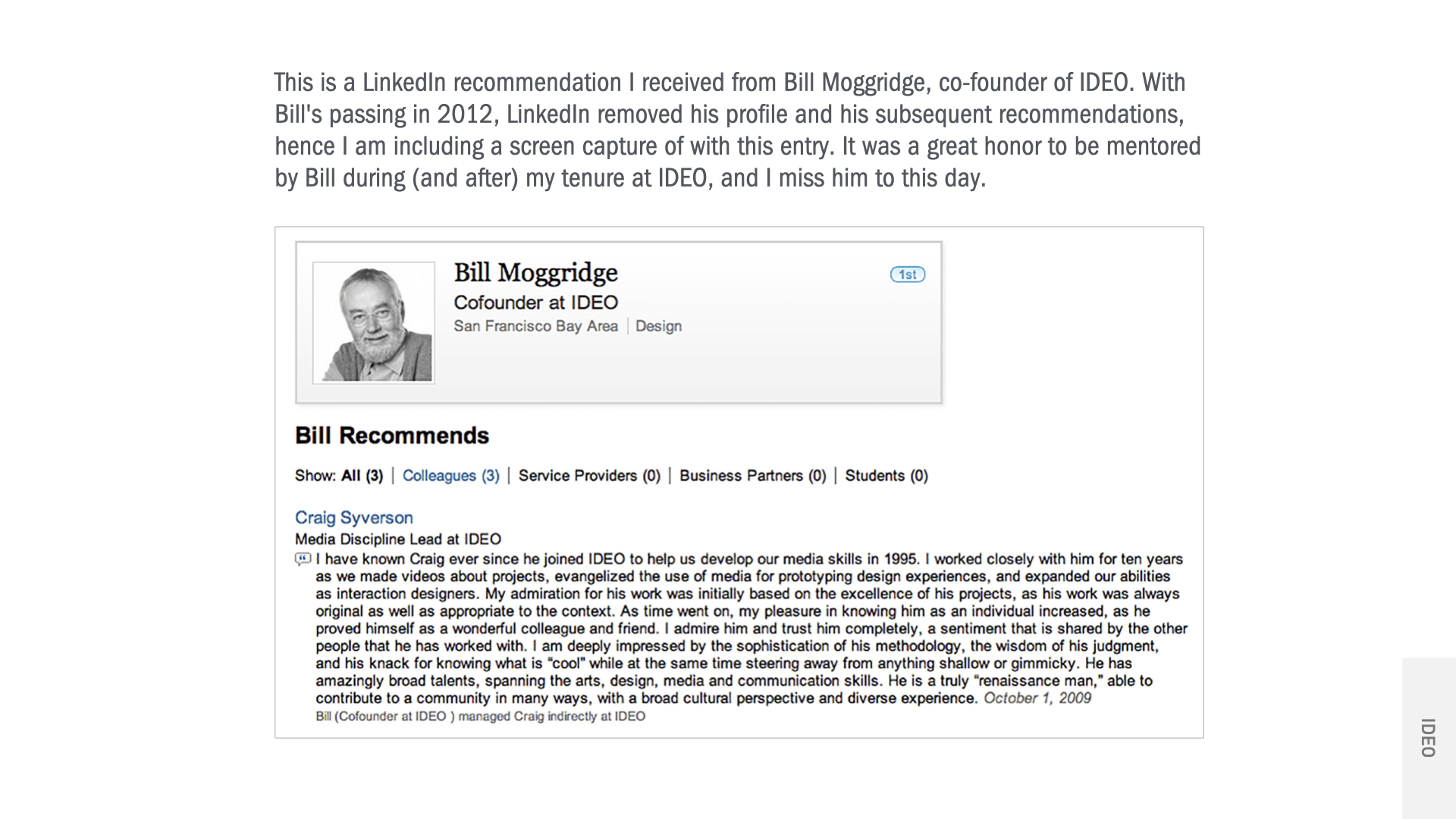
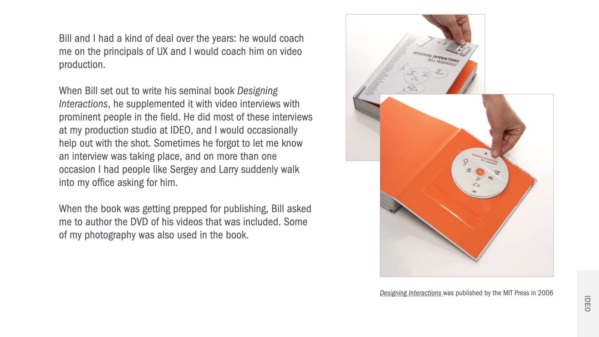
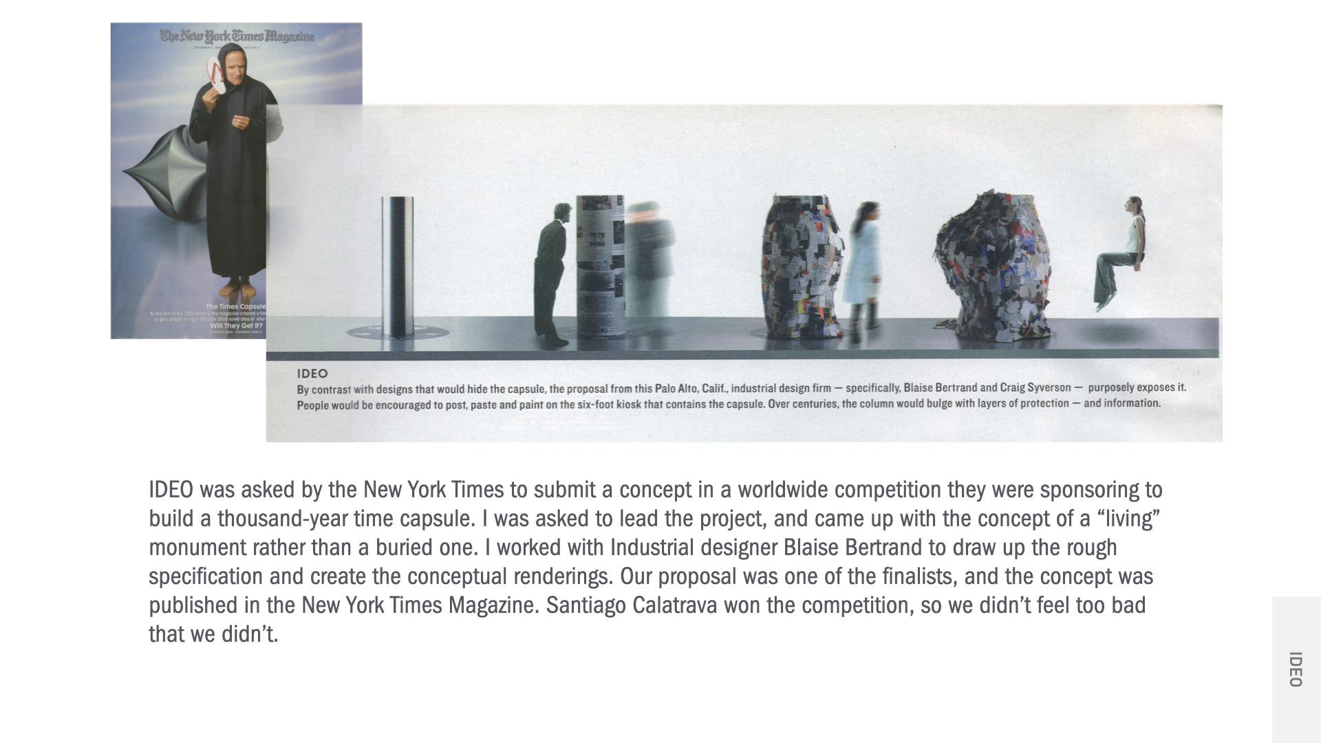
The origin of the Storytelling Disciple, related articles, etc.
museum of modern art - personal skies
Naoto Fukasawa, then the head of IDEO’s Tokyo office, was invited to create a work for an exhibit at MoMA. I was a part of the small team from IDEO Palo Alto that built out Naoto’s concept. I was in charge of the “sky projection” portion of the piece, which entailed all of the sky photography and sequence animations, as well as specifying and installing the projection system at the museum. For this document video, I composed and performed the music track, and edited the footage which was primarily shot by Greg Tuzin.
crave conference opener
IDEO produced a design conference in the early aughts in San Francisco. I conceived and created this video that was the cold open to the conference to the live audience in attendance. Shot on location at El Mirage Dry Lake in California. Additional camera by Greg Tuzin.
prada - enhanced retail experience
IDEO London designed a number of new technologies for Prada to enhance their customer retail experience. Prada’s new flagship store in Manhattan was the first to implement them, and this video demonstrates their use. We had access to the store two nights before it had its grand opening to do the interior shots.
This is an example of a video I did as a part of an internal weekend project by the UX group. The challenge was that each team was to come up with a novel business idea and give a formal presentation for it on Monday. When the dystopian idea of CCRM was thought up, they asked me to produce the video in collaboration with them. We started on Saturday with a very loose shooting script, and I finished the final edit late Sunday night. Most of the spoken lines were improvised with prompts from Marcus Gosling. It was one of my favorite projects.
concept - ccrm
This video was a rapid prototype of a video player concept I had for Lincoln Center. The architecture firm Skidmore, Owings and Merrill was invited by the Lincoln Center to compete in a design charette for their major remodel. To flesh out the concept beyond just the structure, SOM invited IDEO and the artist James Turrell (my idol) to flesh out the concept beyond the structure.
I chose the form of opera glasses as it’s socially acceptable behavior to use them during a performance, and the light from the internal displays would not be distracting to other audience members. The video was included in SOM’s submission to Lincoln Center.
Lincoln Center Opera Glass Concept
logitech wingman
Example a quick video made to supplement an entry for design award for the steering wheel gaming controller we designed for Logitech. These purpose of these videos was to demonstrate the products use and show some of the its design features in under three minutes.
yamaha children’s keyboard
This is a very early example of another design award entry video. Since this was a children’s product, I downsampled the footage to give an overall sense of an old home movie, juxtaposed with detailed shots of the product itself in a well-lit setting. The music was an original composition I played on the keyboard itself, making free use of some of the internal sound effects and looping features.
art direction - magazine back cover advertisement for IDEO
The other part of my role at IDEO was to manage our in-house photography. The standard for formal industrial design photography at the time was by using 8X10 tilt-shift film cameras. I managed our staff photographer who had the considerable expertise and talent with the proper use of these cameras and the strobe lighting array needed to shoot them. As IDEO would regularly advertise in the major industrial design journals (usually by buying the full back cover) we needed excellent formal documentation of our finished work.
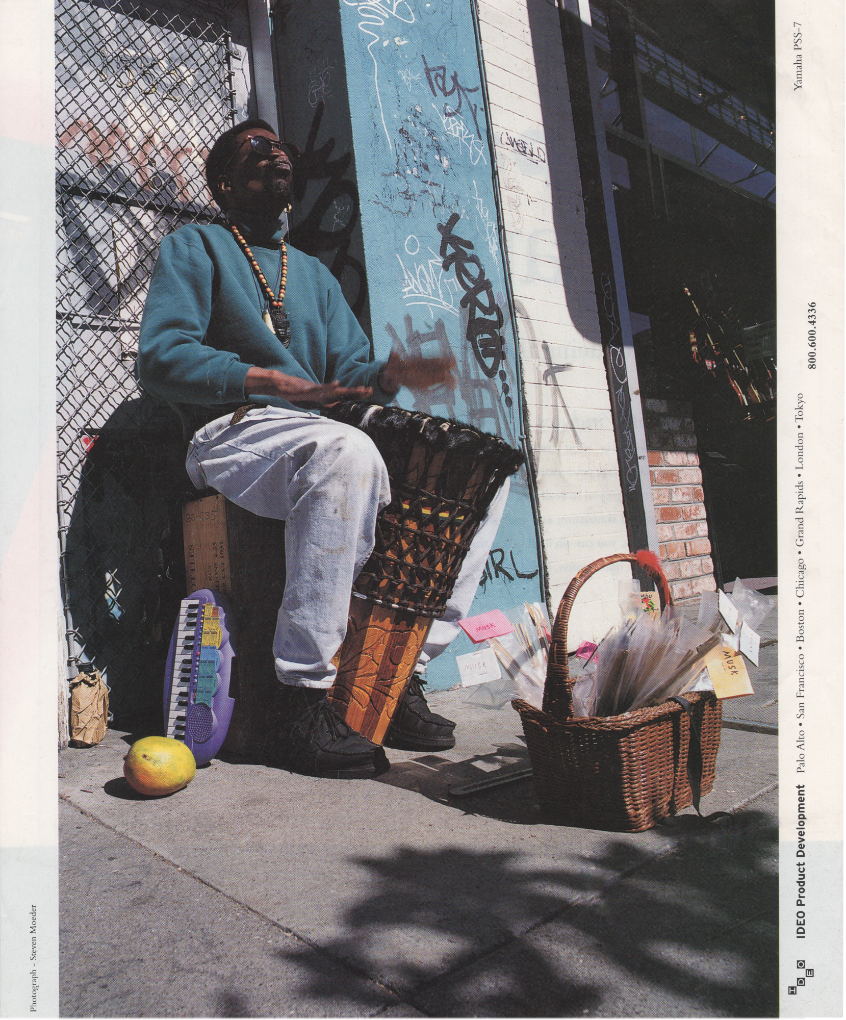
Occasionally I would direct a photo shoot if the occasion called for it, usually related to photos needed in the field. At one point we (the designer Martin Bone, the Marketing group and I) decided to run a mini-campaign of ads that showed one of our designed products in a very informal context, almost messy, just sitting somewhere in the background near the person who was using it in their everyday life. It was the opposite of an abstracted, glamorized setting that all design firms, including us, had adopted as the photo standard. This image, also featuring the Yamaha keyboard, is an example from this campaign that I conceived and art directed with our photographer. It was shot on location at Haight Street in San Francisco that I had scouted previously. The djembe player was a regular presence on the street, and I hired him for the shot. This ad ran on the back cover of I.D. Magazine, one of a series of three.
